Triángulo Central en la parte Inferior del Div
Estoy tratando de tener un triángulo/flecha en la parte inferior de mi héroe, pero no es sensible y no funciona muy bien en el móvil, ya que el triángulo flota hacia la derecha y ya no está absolutamente centrado.
¿Cómo podría mantener el triángulo posicionado en el centro absoluto en la parte inferior del div en todo momento?
Ejemplo de código aquí:
HTML:
<div class="hero"></div>
CSS:
.hero {
    position:relative;
    background-color:#e15915;
    height:320px !important;
    width:100% !important;


}


.hero:after,
.hero:after {
    z-index: -1;
    position: absolute;
    top: 98.1%;
    left: 70%;
    margin-left: -25%;
    content: '';
    width: 0;
    height: 0;
    border-top: solid 50px #e15915;
    border-left: solid 50px transparent;
    border-right: solid 50px transparent;
}
4 answers
¿No puedes simplemente establecer left en 50% y luego tener margin-left establecido en -25px para tener en cuenta su ancho: http://jsfiddle.net/9AbYc /
.hero:after {
    content:'';
    position: absolute;
    top: 100%;
    left: 50%;
    margin-left: -50px;
    width: 0;
    height: 0;
    border-top: solid 50px #e15915;
    border-left: solid 50px transparent;
    border-right: solid 50px transparent;
}
O si necesitas un ancho variable puedes usar: http://jsfiddle.net/9AbYc/1 /
.hero:after {
    content:'';
    position: absolute;
    top: 100%;
    left: 0;
    right: 0;
    margin: 0 auto;
    width: 0;
    height: 0;
    border-top: solid 50px #e15915;
    border-left: solid 50px transparent;
    border-right: solid 50px transparent;
}
Warning: date(): Invalid date.timezone value 'Europe/Kyiv', we selected the timezone 'UTC' for now. in /var/www/agent_stack/data/www/ajaxhispano.com/template/agent.layouts/content.php on line 61
2014-06-21 21:49:29
Puede usar el siguiente css para hacer que un elemento esté alineado con position: absolute:
.element {
  transform: translateX(-50%);
  position: absolute;
  left: 50%;
}
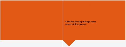
Con CSS teniendo solo left: 50% tendremos el siguiente efecto:
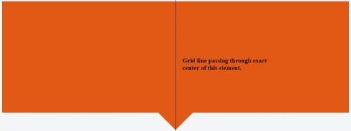
Al combinar left: 50% con transform: translate(-50%) tendremos lo siguiente:
.hero {
  background-color: #e15915;
  position: relative;
  height: 320px;
  width: 100%;
}


.hero:after {
  border-right: solid 50px transparent;
  border-left: solid 50px transparent;
  border-top: solid 50px #e15915;
  transform: translateX(-50%);
  position: absolute;
  z-index: -1;
  content: '';
  top: 100%;
  left: 50%;
  height: 0;
  width: 0;
}
<div class="hero">
</div>Warning: date(): Invalid date.timezone value 'Europe/Kyiv', we selected the timezone 'UTC' for now. in /var/www/agent_stack/data/www/ajaxhispano.com/template/agent.layouts/content.php on line 61
2016-12-26 07:56:44
Comprueba esto:
.hero1
{
    width: 90%;
    height: 200px;
    margin: auto;
    background-color: #e15915;
}

.hero2
{
    width: 0px;
    height: 0px;
    border-style: solid;
    margin: auto;
    border-width: 90px 58px 0 58px;
    border-color: #e15915 transparent transparent transparent;
    line-height: 0px;
    _border-color: #e15915 #000000 #000000 #000000;
    _filter: progid:DXImageTransform.Microsoft.Chroma(color='#000000')
}
Warning: date(): Invalid date.timezone value 'Europe/Kyiv', we selected the timezone 'UTC' for now. in /var/www/agent_stack/data/www/ajaxhispano.com/template/agent.layouts/content.php on line 61
2013-11-01 01:00:21
También podría usar un CSS "calc" para obtener el mismo efecto en lugar de usar el margen negativo o las propiedades de transformación (en caso de que desee usar esas propiedades para cualquier otra cosa).
.hero:after,
.hero:after {
    z-index: -1;
    position: absolute;
    top: 98.1%;
    left: calc(50% - 25px);
    content: '';
    width: 0;
    height: 0;
    border-top: solid 50px #e15915;
    border-left: solid 50px transparent;
    border-right: solid 50px transparent;
}
Warning: date(): Invalid date.timezone value 'Europe/Kyiv', we selected the timezone 'UTC' for now. in /var/www/agent_stack/data/www/ajaxhispano.com/template/agent.layouts/content.php on line 61
2017-12-31 17:46:48