matplotlib: Gráficas de caja de grupo
¿Hay alguna forma de agrupar gráficas de caja en matplotlib?
Supongamos que tenemos tres grupos "A", "B" y "C" y para cada uno queremos crear una gráfica de caja tanto para "manzanas" como para "naranjas". Si un agrupamiento no es posible directamente, podemos crear las seis combinaciones y colocarlas linealmente una al lado de la otra. ¿Cuál sería la forma más sencilla de visualizar las agrupaciones? Estoy tratando de evitar el establecimiento de las etiquetas de marca a algo así como "manzanas A +" ya que mi escenario implica nombres mucho más largos que "A".
6 answers
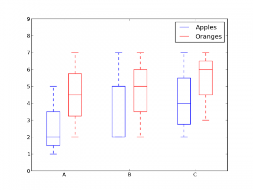
¿Qué tal usar colores para diferenciar entre "manzanas" y "naranjas" y espaciar para separar "A", "B" y "C"?
Algo como esto:
from pylab import plot, show, savefig, xlim, figure, \
                hold, ylim, legend, boxplot, setp, axes

# function for setting the colors of the box plots pairs
def setBoxColors(bp):
    setp(bp['boxes'][0], color='blue')
    setp(bp['caps'][0], color='blue')
    setp(bp['caps'][1], color='blue')
    setp(bp['whiskers'][0], color='blue')
    setp(bp['whiskers'][1], color='blue')
    setp(bp['fliers'][0], color='blue')
    setp(bp['fliers'][1], color='blue')
    setp(bp['medians'][0], color='blue')

    setp(bp['boxes'][1], color='red')
    setp(bp['caps'][2], color='red')
    setp(bp['caps'][3], color='red')
    setp(bp['whiskers'][2], color='red')
    setp(bp['whiskers'][3], color='red')
    setp(bp['fliers'][2], color='red')
    setp(bp['fliers'][3], color='red')
    setp(bp['medians'][1], color='red')

# Some fake data to plot
A= [[1, 2, 5,],  [7, 2]]
B = [[5, 7, 2, 2, 5], [7, 2, 5]]
C = [[3,2,5,7], [6, 7, 3]]

fig = figure()
ax = axes()
hold(True)

# first boxplot pair
bp = boxplot(A, positions = [1, 2], widths = 0.6)
setBoxColors(bp)

# second boxplot pair
bp = boxplot(B, positions = [4, 5], widths = 0.6)
setBoxColors(bp)

# thrid boxplot pair
bp = boxplot(C, positions = [7, 8], widths = 0.6)
setBoxColors(bp)

# set axes limits and labels
xlim(0,9)
ylim(0,9)
ax.set_xticklabels(['A', 'B', 'C'])
ax.set_xticks([1.5, 4.5, 7.5])

# draw temporary red and blue lines and use them to create a legend
hB, = plot([1,1],'b-')
hR, = plot([1,1],'r-')
legend((hB, hR),('Apples', 'Oranges'))
hB.set_visible(False)
hR.set_visible(False)

savefig('boxcompare.png')
show()
Warning: date(): Invalid date.timezone value 'Europe/Kyiv', we selected the timezone 'UTC' for now. in /var/www/agent_stack/data/www/ajaxhispano.com/template/agent.layouts/content.php on line 61
2016-07-07 12:48:46
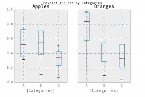
Una forma sencilla sería usar pandas. Adapté un ejemplo de la documentación de trazado :
In [1]: import pandas as pd, numpy as np

In [2]: df = pd.DataFrame(np.random.rand(12,2), columns=['Apples', 'Oranges'] )

In [3]: df['Categories'] = pd.Series(list('AAAABBBBCCCC'))

In [4]: pd.options.display.mpl_style = 'default'

In [5]: df.boxplot(by='Categories')
Out[5]:
array([<matplotlib.axes.AxesSubplot object at 0x51a5190>,
       <matplotlib.axes.AxesSubplot object at 0x53fddd0>], dtype=object)
Warning: date(): Invalid date.timezone value 'Europe/Kyiv', we selected the timezone 'UTC' for now. in /var/www/agent_stack/data/www/ajaxhispano.com/template/agent.layouts/content.php on line 61
2018-04-09 11:46:44
Aquí está mi versión. Almacena datos basados en categorías.
import matplotlib.pyplot as plt
import numpy as np

data_a = [[1,2,5], [5,7,2,2,5], [7,2,5]]
data_b = [[6,4,2], [1,2,5,3,2], [2,3,5,1]]

ticks = ['A', 'B', 'C']

def set_box_color(bp, color):
    plt.setp(bp['boxes'], color=color)
    plt.setp(bp['whiskers'], color=color)
    plt.setp(bp['caps'], color=color)
    plt.setp(bp['medians'], color=color)

plt.figure()

bpl = plt.boxplot(data_a, positions=np.array(xrange(len(data_a)))*2.0-0.4, sym='', widths=0.6)
bpr = plt.boxplot(data_b, positions=np.array(xrange(len(data_b)))*2.0+0.4, sym='', widths=0.6)
set_box_color(bpl, '#D7191C') # colors are from http://colorbrewer2.org/
set_box_color(bpr, '#2C7BB6')

# draw temporary red and blue lines and use them to create a legend
plt.plot([], c='#D7191C', label='Apples')
plt.plot([], c='#2C7BB6', label='Oranges')
plt.legend()

plt.xticks(xrange(0, len(ticks) * 2, 2), ticks)
plt.xlim(-2, len(ticks)*2)
plt.ylim(0, 8)
plt.tight_layout()
plt.savefig('boxcompare.png')
Me falta reputación, así que no puedo publicar una imagen aquí. Puedes ejecutarlo y ver el resultado. Básicamente es muy similar a lo que hizo Molly.
Tenga en cuenta que, dependiendo de la versión de python que esté utilizando, es posible que deba reemplazar xrange por range

Warning: date(): Invalid date.timezone value 'Europe/Kyiv', we selected the timezone 'UTC' for now. in /var/www/agent_stack/data/www/ajaxhispano.com/template/agent.layouts/content.php on line 61
2018-03-07 15:10:42
Solo para agregar a la conversación, he encontrado una manera más elegante de cambiar el color de la gráfica de caja iterando sobre el diccionario del objeto en sí
import numpy as np
import matplotlib.pyplot as plt

def color_box(bp, color):

    # Define the elements to color. You can also add medians, fliers and means
    elements = ['boxes','caps','whiskers']

    # Iterate over each of the elements changing the color
    for elem in elements:
        [plt.setp(bp[elem][idx], color=color) for idx in xrange(len(bp[elem]))]
    return

a = np.random.uniform(0,10,[100,5])

bp = plt.boxplot(a)
color_box(bp, 'red')


Salud!
Warning: date(): Invalid date.timezone value 'Europe/Kyiv', we selected the timezone 'UTC' for now. in /var/www/agent_stack/data/www/ajaxhispano.com/template/agent.layouts/content.php on line 61
2016-03-03 17:24:14
Datos simulados:
df = pd.DataFrame({'Group':['A','A','A','B','C','B','B','C','A','C'],\
                  'Apple':np.random.rand(10),'Orange':np.random.rand(10)})
df = df[['Group','Apple','Orange']]

        Group    Apple     Orange
    0      A  0.465636  0.537723
    1      A  0.560537  0.727238
    2      A  0.268154  0.648927
    3      B  0.722644  0.115550
    4      C  0.586346  0.042896
    5      B  0.562881  0.369686
    6      B  0.395236  0.672477
    7      C  0.577949  0.358801
    8      A  0.764069  0.642724
    9      C  0.731076  0.302369
Puede utilizar la biblioteca Seaborn para estas parcelas. Primero melt el dataframe para formatear los datos y luego crear la gráfica de caja de su elección.
import pandas as pd
import matplotlib.pyplot as plt
import seaborn as sns
dd=pd.melt(df,id_vars=['Group'],value_vars=['Apple','Orange'],var_name='fruits')
sns.boxplot(x='Group',y='value',data=dd,hue='fruits')

Warning: date(): Invalid date.timezone value 'Europe/Kyiv', we selected the timezone 'UTC' for now. in /var/www/agent_stack/data/www/ajaxhispano.com/template/agent.layouts/content.php on line 61
2018-02-11 20:47:03
Aquí hay una función que escribí que toma el código de Molly y algún otro código que he encontrado en Internet para hacer cuadros agrupados un poco más elegantes:
import numpy as np
import matplotlib.pyplot as plt

def custom_legend(colors, labels, linestyles=None):
    """ Creates a list of matplotlib Patch objects that can be passed to the legend(...) function to create a custom
        legend.

    :param colors: A list of colors, one for each entry in the legend. You can also include a linestyle, for example: 'k--'
    :param labels:  A list of labels, one for each entry in the legend.
    """

    if linestyles is not None:
        assert len(linestyles) == len(colors), "Length of linestyles must match length of colors."

    h = list()
    for k,(c,l) in enumerate(zip(colors, labels)):
        clr = c
        ls = 'solid'
        if linestyles is not None:
            ls = linestyles[k]
        patch = patches.Patch(color=clr, label=l, linestyle=ls)
        h.append(patch)
    return h


def grouped_boxplot(data, group_names=None, subgroup_names=None, ax=None, subgroup_colors=None,
                    box_width=0.6, box_spacing=1.0):
    """ Draws a grouped boxplot. The data should be organized in a hierarchy, where there are multiple
        subgroups for each main group.

    :param data: A dictionary of length equal to the number of the groups. The key should be the
                group name, the value should be a list of arrays. The length of the list should be
                equal to the number of subgroups.
    :param group_names: (Optional) The group names, should be the same as data.keys(), but can be ordered.
    :param subgroup_names: (Optional) Names of the subgroups.
    :param subgroup_colors: A list specifying the plot color for each subgroup.
    :param ax: (Optional) The axis to plot on.
    """

    if group_names is None:
        group_names = data.keys()

    if ax is None:
        ax = plt.gca()
    plt.sca(ax)

    nsubgroups = np.array([len(v) for v in data.values()])
    assert len(np.unique(nsubgroups)) == 1, "Number of subgroups for each property differ!"
    nsubgroups = nsubgroups[0]

    if subgroup_colors is None:
        subgroup_colors = list()
        for k in range(nsubgroups):
            subgroup_colors.append(np.random.rand(3))
    else:
        assert len(subgroup_colors) == nsubgroups, "subgroup_colors length must match number of subgroups (%d)" % nsubgroups

    def _decorate_box(_bp, _d):
        plt.setp(_bp['boxes'], lw=0, color='k')
        plt.setp(_bp['whiskers'], lw=3.0, color='k')

        # fill in each box with a color
        assert len(_bp['boxes']) == nsubgroups
        for _k,_box in enumerate(_bp['boxes']):
            _boxX = list()
            _boxY = list()
            for _j in range(5):
                _boxX.append(_box.get_xdata()[_j])
                _boxY.append(_box.get_ydata()[_j])
            _boxCoords = zip(_boxX, _boxY)
            _boxPolygon = plt.Polygon(_boxCoords, facecolor=subgroup_colors[_k])
            ax.add_patch(_boxPolygon)

        # draw a black line for the median
        for _k,_med in enumerate(_bp['medians']):
            _medianX = list()
            _medianY = list()
            for _j in range(2):
                _medianX.append(_med.get_xdata()[_j])
                _medianY.append(_med.get_ydata()[_j])
                plt.plot(_medianX, _medianY, 'k', linewidth=3.0)

            # draw a black asterisk for the mean
            plt.plot([np.mean(_med.get_xdata())], [np.mean(_d[_k])], color='w', marker='*',
                      markeredgecolor='k', markersize=12)

    cpos = 1
    label_pos = list()
    for k in group_names:
        d = data[k]
        nsubgroups = len(d)
        pos = np.arange(nsubgroups) + cpos
        label_pos.append(pos.mean())
        bp = plt.boxplot(d, positions=pos, widths=box_width)
        _decorate_box(bp, d)
        cpos += nsubgroups + box_spacing

    plt.xlim(0, cpos-1)
    plt.xticks(label_pos, group_names)

    if subgroup_names is not None:
        leg = custom_legend(subgroup_colors, subgroup_names)
        plt.legend(handles=leg)
Puedes usar la(s) función (es) de esta manera:
data = { 'A':[np.random.randn(100), np.random.randn(100) + 5],
         'B':[np.random.randn(100)+1, np.random.randn(100) + 9],
         'C':[np.random.randn(100)-3, np.random.randn(100) -5]
       }

grouped_boxplot(data, group_names=['A', 'B', 'C'], subgroup_names=['Apples', 'Oranges'], subgroup_colors=['#D02D2E', '#D67700'])
plt.show()
Warning: date(): Invalid date.timezone value 'Europe/Kyiv', we selected the timezone 'UTC' for now. in /var/www/agent_stack/data/www/ajaxhispano.com/template/agent.layouts/content.php on line 61
2015-12-29 01:59:51