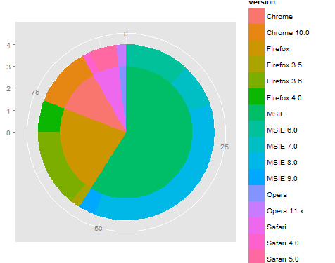
ggplot2 gráfico circular y de donas en la misma gráfica
Estoy tratando de replicar esto 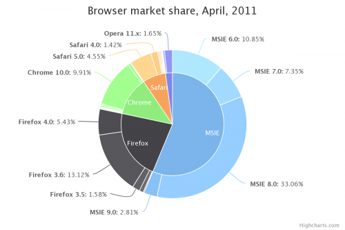 con R ggplot. Tengo exactamente los mismos datos:
browsers<-structure(list(browser = structure(c(3L, 3L, 3L, 3L, 2L, 2L,
2L, 1L, 5L, 5L, 4L), .Label = c("Chrome", "Firefox", "MSIE",
"Opera", "Safari"), class = "factor"), version = structure(c(5L,
6L, 7L, 8L, 2L, 3L, 4L, 1L, 10L, 11L, 9L), .Label = c("Chrome 10.0",
"Firefox 3.5", "Firefox 3.6", "Firefox 4.0", "MSIE 6.0", "MSIE 7.0",
"MSIE 8.0", "MSIE 9.0", "Opera 11.x", "Safari 4.0", "Safari 5.0"
), class = "factor"), share = c(10.85, 7.35, 33.06, 2.81, 1.58,
13.12, 5.43, 9.91, 1.42, 4.55, 1.65), ymax = c(10.85, 18.2, 51.26,
54.07, 55.65, 68.77, 74.2, 84.11, 85.53, 90.08, 91.73), ymin = c(0,
10.85, 18.2, 51.26, 54.07, 55.65, 68.77, 74.2, 84.11, 85.53,
90.08)), .Names = c("browser", "version", "share", "ymax", "ymin"
), row.names = c(NA, -11L), class = "data.frame")
Y se ve así:
> browsers
   browser      version  share   ymax   ymin
1     MSIE     MSIE 6.0  10.85  10.85   0.00
2     MSIE     MSIE 7.0   7.35  18.20  10.85
3     MSIE     MSIE 8.0  33.06  51.26  18.20
4     MSIE     MSIE 9.0   2.81  54.07  51.26
5  Firefox  Firefox 3.5   1.58  55.65  54.07
6  Firefox  Firefox 3.6  13.12  68.77  55.65
7  Firefox  Firefox 4.0   5.43  74.20  68.77
8   Chrome  Chrome 10.0   9.91  84.11  74.20
9   Safari   Safari 4.0   1.42  85.53  84.11
10  Safari   Safari 5.0   4.55  90.08  85.53
11   Opera   Opera 11.x   1.65  91.73  90.08
Hasta ahora, he trazado los componentes individuales (es decir, el gráfico de donas de las versiones y el gráfico circular de los navegadores) de la siguiente manera:
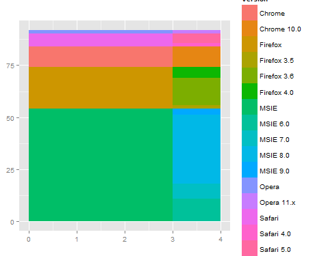
ggplot(browsers) + geom_rect(aes(fill=version, ymax=ymax, ymin=ymin, xmax=4, xmin=3)) +
coord_polar(theta="y") + xlim(c(0, 4))
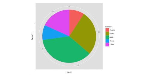
ggplot(browsers) + geom_bar(aes(x = factor(1), fill = browser),width = 1) +
coord_polar(theta="y")
El problema es, ¿cómo combino los dos para parecerse a la imagen superior? He intentado muchas maneras, tales como:
ggplot(browsers) + geom_rect(aes(fill=version, ymax=ymax, ymin=ymin, xmax=4, xmin=3)) + geom_bar(aes(x = factor(1), fill = browser),width = 1) + coord_polar(theta="y") + xlim(c(0, 4))
, Pero todos mis resultados son torcido o termina con un mensaje de error.
5 answers
Me resulta más fácil trabajar en coordenadas rectangulares primero, y cuando eso es correcto, luego cambiar a coordenadas polares. La coordenada x se convierte en radio en polar. Así, en coordenadas rectangulares, la parcela interior va de cero a un número, como 3, y la banda exterior va de 3 a 4.
Por ejemplo
ggplot(browsers) +
  geom_rect(aes(fill=version, ymax=ymax, ymin=ymin, xmax=4, xmin=3)) +
  geom_rect(aes(fill=browser, ymax=ymax, ymin=ymin, xmax=3, xmin=0)) +
  xlim(c(0, 4)) +
  theme(aspect.ratio=1)
Luego, cuando cambias a polar, obtienes algo como lo que estás buscando.
ggplot(browsers) +
  geom_rect(aes(fill=version, ymax=ymax, ymin=ymin, xmax=4, xmin=3)) +
  geom_rect(aes(fill=browser, ymax=ymax, ymin=ymin, xmax=3, xmin=0)) +
  xlim(c(0, 4)) +
  theme(aspect.ratio=1) +
  coord_polar(theta="y")
Esto es un comienzo, pero puede ser necesario afine la dependencia de y (o ángulo) y también resuelva el etiquetado / leyenda / coloración... Mediante el uso de rect para los anillos interior y exterior, que debe simplificar el ajuste de la coloración. Además, puede ser útil usar la función reshape2::melt para reorganizar los datos para que la leyenda salga correcta usando group (o color).
Warning: date(): Invalid date.timezone value 'Europe/Kyiv', we selected the timezone 'UTC' for now. in /var/www/agent_stack/data/www/ajaxhispano.com/template/agent.layouts/content.php on line 61
2014-11-05 02:58:25
Editar 2
Mi respuesta original es realmente tonta. Aquí hay una versión mucho más corta que hace la mayor parte del trabajo con una interfaz mucho más simple.
#' x      numeric vector for each slice
#' group  vector identifying the group for each slice
#' labels vector of labels for individual slices
#' col    colors for each group
#' radius radius for inner and outer pie (usually in [0,1])

donuts <- function(x, group = 1, labels = NA, col = NULL, radius = c(.7, 1)) {
  group <- rep_len(group, length(x))
  ug  <- unique(group)
  tbl <- table(group)[order(ug)]

  col <- if (is.null(col))
    seq_along(ug) else rep_len(col, length(ug))
  col.main <- Map(rep, col[seq_along(tbl)], tbl)
  col.sub  <- lapply(col.main, function(x) {
    al <- head(seq(0, 1, length.out = length(x) + 2L)[-1L], -1L)
    Vectorize(adjustcolor)(x, alpha.f = al)
  })

  plot.new()

  par(new = TRUE)
  pie(x, border = NA, radius = radius[2L],
      col = unlist(col.sub), labels = labels)

  par(new = TRUE)
  pie(x, border = NA, radius = radius[1L],
      col = unlist(col.main), labels = NA)
}

par(mfrow = c(1,2), mar = c(0,4,0,4))
with(browsers,
     donuts(share, browser, sprintf('%s: %s%%', version, share),
            col = c('cyan2','red','orange','green','dodgerblue2'))
)

with(mtcars,
     donuts(mpg, interaction(gear, cyl), rownames(mtcars))
)

Post original
Ustedes no tienen givemedonutsorgivemedeath función? Los gráficos base son siempre el camino a seguir para cosas muy detalladas como esta. Sin embargo, no se me ocurrió una forma elegante de trazar las etiquetas del pastel central.
givemedonutsorgivemedeath('~/desktop/donuts.pdf')
Da me
Tenga en cuenta que en ?pie se ve
Pie charts are a very bad way of displaying information.
Código:
browsers <- structure(list(browser = structure(c(3L, 3L, 3L, 3L, 2L, 2L,
  2L, 1L, 5L, 5L, 4L), .Label = c("Chrome", "Firefox", "MSIE",
  "Opera", "Safari"), class = "factor"), version = structure(c(5L,
  6L, 7L, 8L, 2L, 3L, 4L, 1L, 10L, 11L, 9L), .Label = c("Chrome 10.0",
  "Firefox 3.5", "Firefox 3.6", "Firefox 4.0", "MSIE 6.0", "MSIE 7.0",
  "MSIE 8.0", "MSIE 9.0", "Opera 11.x", "Safari 4.0", "Safari 5.0"),
  class = "factor"), share = c(10.85, 7.35, 33.06, 2.81, 1.58,
  13.12, 5.43, 9.91, 1.42, 4.55, 1.65), ymax = c(10.85, 18.2, 51.26,
  54.07, 55.65, 68.77, 74.2, 84.11, 85.53, 90.08, 91.73), ymin = c(0,
  10.85, 18.2, 51.26, 54.07, 55.65, 68.77, 74.2, 84.11, 85.53,
  90.08)), .Names = c("browser", "version", "share", "ymax", "ymin"),
  row.names = c(NA, -11L), class = "data.frame")

browsers$total <- with(browsers, ave(share, browser, FUN = sum))

givemedonutsorgivemedeath <- function(file, width = 15, height = 11) {
  ## house keeping
  if (missing(file)) file <- getwd()
  plot.new(); op <- par(no.readonly = TRUE); on.exit(par(op))

  pdf(file, width = width, height = height, bg = 'snow')

  ## useful values and colors to work with
  ## each group will have a specific color
  ## each subgroup will have a specific shade of that color
  nr <- nrow(browsers)
  width <- max(sqrt(browsers$share)) / 0.8

  tbl <- with(browsers, table(browser)[order(unique(browser))])
  cols <- c('cyan2','red','orange','green','dodgerblue2')
  cols <- unlist(Map(rep, cols, tbl))

  ## loop creates pie slices
  plot.new()
  par(omi = c(0.5,0.5,0.75,0.5), mai = c(0.1,0.1,0.1,0.1), las = 1)
  for (i in 1:nr) {
    par(new = TRUE)

    ## create color/shades
    rgb <- col2rgb(cols[i])
    f0 <- rep(NA, nr)
    f0[i] <- rgb(rgb[1], rgb[2], rgb[3], 190 / sequence(tbl)[i], maxColorValue = 255)

    ## stick labels on the outermost section
    lab <- with(browsers, sprintf('%s: %s', version, share))
    if (with(browsers, share[i] == max(share))) {
      lab0 <- lab
    } else lab0 <- NA

    ## plot the outside pie and shades of subgroups
    pie(browsers$share, border = NA, radius = 5 / width, col = f0,
        labels = lab0, cex = 1.8)

    ## repeat above for the main groups
    par(new = TRUE)
    rgb <- col2rgb(cols[i])
    f0[i] <- rgb(rgb[1], rgb[2], rgb[3], maxColorValue = 255)

    pie(browsers$share, border = NA, radius = 4 / width, col = f0, labels = NA)
  }

  ## extra labels on graph

  ## center labels, guess and check?
  text(x = c(-.05, -.05, 0.15, .25, .3), y = c(.08, -.12, -.15, -.08, -.02),
       labels = unique(browsers$browser), col = 'white', cex = 1.2)

  mtext('Browser market share, April 2011', side = 3, line = -1, adj = 0,
        cex = 3.5, outer = TRUE)
  mtext('stackoverflow.com:::maryam', side = 3, line = -3.6, adj = 0,
        cex = 1.75, outer = TRUE, font = 3)
  mtext('/questions/26748069/ggplot2-pie-and-donut-chart-on-same-plot',
        side = 1, line = 0, adj = 1.0, cex = 1.2, outer = TRUE, font = 3)
  dev.off()
}

givemedonutsorgivemedeath('~/desktop/donuts.pdf')
Editar 1
width <- 5

tbl <- table(browsers$browser)[order(unique(browsers$browser))]
col.main <- Map(rep, seq_along(tbl), tbl)
col.sub  <- lapply(col.main, function(x)
  Vectorize(adjustcolor)(x, alpha.f = seq_along(x) / length(x)))

plot.new()

par(new = TRUE)
pie(browsers$share, border = NA, radius = 5 / width,
    col = unlist(col.sub), labels = browsers$version)

par(new = TRUE)
pie(browsers$share, border = NA, radius = 4 / width,
    col = unlist(col.main), labels = NA)
Warning: date(): Invalid date.timezone value 'Europe/Kyiv', we selected the timezone 'UTC' for now. in /var/www/agent_stack/data/www/ajaxhispano.com/template/agent.layouts/content.php on line 61
2017-02-14 18:40:05
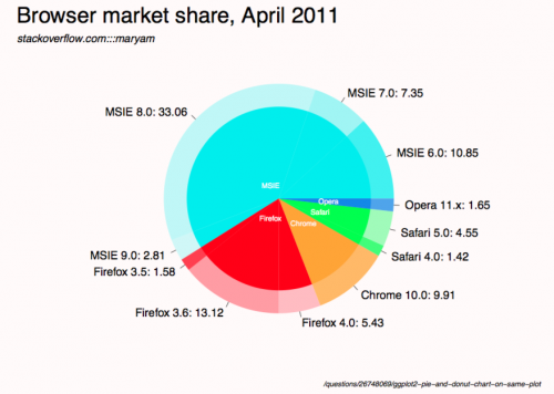
Creé una función de trazado de donuts de propósito general para hacer esto, que podría
- Dibujar la gráfica de anillo, es decir, dibujar la gráfica circular para
panely colorear cada sector circular por un porcentaje dadopctrycolorscols. El ancho del anillo podría ser ajustado poroutradius>radius>innerradius. - Superponga varios gráficos de anillos juntos.
La función principal en realidad dibuja un gráfico de barras y lo dobla en un anillo, por lo tanto, es algo entre un gráfico circular y un gráfico de barras.
Ejemplo de Pastel Gráfico, dos anillos:

Gráfico circular del navegador

donuts_plot <- function(
                        panel = runif(3), # counts
                        pctr = c(.5,.2,.9), # percentage in count
                        legend.label='',
                        cols = c('chartreuse', 'chocolate','deepskyblue'), # colors
                        outradius = 1, # outter radius
                        radius = .7,   # 1-width of the donus
                        add = F,
                        innerradius = .5, # innerradius, if innerradius==innerradius then no suggest line
                        legend = F,
                        pilabels=F,
                        legend_offset=.25, # non-negative number, legend right position control
                        borderlit=c(T,F,T,T)
                        ){
    par(new=add)
    if(sum(legend.label=='')>=1) legend.label=paste("Series",1:length(pctr))
    if(pilabels){
        pie(panel, col=cols,border = borderlit[1],labels = legend.label,radius = outradius)
    }
    panel = panel/sum(panel)

    pctr2= panel*(1 - pctr)
    pctr3 = c(pctr,pctr)
    pctr_indx=2*(1:length(pctr))
    pctr3[pctr_indx]=pctr2
    pctr3[-pctr_indx]=panel*pctr
    cols_fill = c(cols,cols)
    cols_fill[pctr_indx]='white'
    cols_fill[-pctr_indx]=cols
    par(new=TRUE)
    pie(pctr3, col=cols_fill,border = borderlit[2],labels = '',radius = outradius)
    par(new=TRUE)
    pie(panel, col='white',border = borderlit[3],labels = '',radius = radius)
    par(new=TRUE)
    pie(1, col='white',border = borderlit[4],labels = '',radius = innerradius)
    if(legend){
        # par(mar=c(5.2, 4.1, 4.1, 8.2), xpd=TRUE)
        legend("topright",inset=c(-legend_offset,0),legend=legend.label, pch=rep(15,'.',length(pctr)),
               col=cols,bty='n')
    }
    par(new=FALSE)
}
## col- > subcor(change hue/alpha)
subcolors <- function(.dta,main,mainCol){
    tmp_dta = cbind(.dta,1,'col')
    tmp1 = unique(.dta[[main]])
    for (i in 1:length(tmp1)){
        tmp_dta$"col"[.dta[[main]] == tmp1[i]] = mainCol[i]
    }
    u <- unlist(by(tmp_dta$"1",tmp_dta[[main]],cumsum))
    n <- dim(.dta)[1]
    subcol=rep(rgb(0,0,0),n);
    for(i in 1:n){
        t1 = col2rgb(tmp_dta$col[i])/256
        subcol[i]=rgb(t1[1],t1[2],t1[3],1/(1+u[i]))
    }
    return(subcol);
}
### Then get the plot is fairly easy:
# INPUT data
browsers <- structure(list(browser = structure(c(3L, 3L, 3L, 3L, 2L, 2L,
                                                 2L, 1L, 5L, 5L, 4L),
                                               .Label = c("Chrome", "Firefox", "MSIE","Opera", "Safari"),class = "factor"),
                           version = structure(c(5L,6L, 7L, 8L, 2L, 3L, 4L, 1L, 10L, 11L, 9L),
                                               .Label = c("Chrome 10.0", "Firefox 3.5", "Firefox 3.6", "Firefox 4.0", "MSIE 6.0",
                                                          "MSIE 7.0","MSIE 8.0", "MSIE 9.0", "Opera 11.x", "Safari 4.0", "Safari 5.0"),
                                               class = "factor"),
                           share = c(10.85, 7.35, 33.06, 2.81, 1.58,13.12, 5.43, 9.91, 1.42, 4.55, 1.65),
                           ymax = c(10.85, 18.2, 51.26,54.07, 55.65, 68.77, 74.2, 84.11, 85.53, 90.08, 91.73),
                           ymin = c(0,10.85, 18.2, 51.26, 54.07, 55.65, 68.77, 74.2, 84.11, 85.53,90.08)),
                      .Names = c("browser", "version", "share", "ymax", "ymin"),
                      row.names = c(NA, -11L), class = "data.frame")
## data clean
browsers=browsers[order(browsers$browser,browsers$share),]
arr=aggregate(share~browser,browsers,sum)
### choose your cols
mainCol =  c('chartreuse3', 'chocolate3','deepskyblue3','gold3','deeppink3')
donuts_plot(browsers$share,rep(1,11),browsers$version,
        cols=subcolors(browsers,"browser",mainCol),
        legend=F,pilabels = T,borderlit = rep(F,4) )
donuts_plot(arr$share,rep(1,5),arr$browser,
        cols=mainCol,pilabels=F,legend=T,legend_offset=-.02,
        outradius = .71,radius = .0,innerradius=.0,add=T,
        borderlit = rep(F,4) )
###end of line
Warning: date(): Invalid date.timezone value 'Europe/Kyiv', we selected the timezone 'UTC' for now. in /var/www/agent_stack/data/www/ajaxhispano.com/template/agent.layouts/content.php on line 61
2016-05-03 22:07:41
La solución de@rawr es realmente agradable, sin embargo, las etiquetas se superpondrán si hay demasiadas. Inspirado por @user3969377 y @FlorianGD , obtuve una nueva solución usando ggplot2 y ggrepel.
1. preparar datos
browsers$ymax <- cumsum(browsers$share) # fed to geom_rect() in piedonut()
browsers$ymin <- browsers$ymax - browsers$share # fed to geom_rect() in piedonut()

browsers$share_browser <- sum(browsers$share[browsers$browser == unique(browsers$browser)[1]]) # "_browser" means at browser level
browsers$ymax_browser <- browsers$share_browser[browsers$browser == unique(browsers$browser)[1]][1]
for (z in 2:length(unique(browsers$browser))) {
  browsers$share_browser[browsers$browser == unique(browsers$browser)[z]] <- sum(browsers$share[browsers$browser == unique(browsers$browser)[z]])
  browsers$ymax_browser[browsers$browser == unique(browsers$browser)[z]] <- browsers$ymax_browser[browsers$browser == unique(browsers$browser)[z-1]][1] + browsers$share_browser[browsers$browser == unique(browsers$browser)[z]][1]
}
browsers$ymin_browser <- browsers$ymax_browser - browsers$share_browser
2. escribe la función piedonut
piedonut <- function(data, cols = c('cyan2','red','orange','green','dodgerblue2'), force = 80, nudge_x = 3, nudge_y = 10) { # force, nudge_x, nudge_y are parameters to fine tune positions of the labels by geom_label_repel.
  nr <- nrow(data)
  # width <- max(sqrt(data$share)) / 0.1

  tbl <- with(data, table(browser)[order(unique(browser))])
  cols <- unlist(Map(rep, cols, tbl))
  col_subnum <- unlist(Map(rep, 255/tbl,tbl))

  col <- rep(NA, nr)
  col_browser <- rep(NA, nr)
  for (i in 1:nr) {
    ## create color/shades
    rgb <- col2rgb(cols[i])
    col[i] <- rgb(rgb[1], rgb[2], rgb[3],  col_subnum[i]*sequence(tbl)[i], maxColorValue = 255)

    rgb <- col2rgb(cols[i])
    col_browser[i] <- rgb(rgb[1], rgb[2], rgb[3], maxColorValue = 255)
  }
  #col
  # set labels positions
  x.breaks <- seq(1, 1.8, length.out = nr)
  y.breaks <- cumsum(data$share)-data$share/2
  ggplot(data) +
    geom_rect(aes(ymax = ymax, ymin = ymin, xmax=4, xmin=1), fill=col) +
    geom_rect(aes(ymax=ymax_browser, ymin=ymin_browser, xmax=1, xmin=0), fill=col_browser) +
    coord_polar(theta = 'y') +
    theme(axis.ticks = element_blank(),
          axis.title = element_blank(),
          axis.text = element_blank(),
          panel.grid = element_blank(),
          panel.background = element_blank()) +
    geom_label_repel(aes(x = x.breaks, y = y.breaks, label = sprintf("%s: %s%%",data$version, data$share)),
                     force = force,
                     nudge_x = nudge_x,
                     nudge_y = nudge_y)
}
3. obtener el piedonut
cols <- c('cyan2','red','orange','green','dodgerblue2')

pdf('~/Downloads/donuts.pdf', width = 10, height = 10, bg = "snow")
par(omi = c(0.5,0.5,0.75,0.5), mai = c(0.1,0.1,0.1,0.1), las = 1)
print(piedonut(data = browsers, cols = cols, force = 80, nudge_x = 3, nudge_y = 10))
dev.off()

Warning: date(): Invalid date.timezone value 'Europe/Kyiv', we selected the timezone 'UTC' for now. in /var/www/agent_stack/data/www/ajaxhispano.com/template/agent.layouts/content.php on line 61
2018-04-26 07:03:27
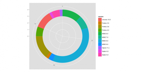
Puede obtener algo similar usando el paquete ggsunburst
# using your data without "ymax" and "ymin"
browsers <- structure(list(browser = structure(c(3L, 3L, 3L, 3L, 2L, 2L,
2L, 1L, 5L, 5L, 4L), .Label = c("Chrome", "Firefox", "MSIE",
"Opera", "Safari"), class = "factor"), version = structure(c(5L,
6L, 7L, 8L, 2L, 3L, 4L, 1L, 10L, 11L, 9L), .Label = c("Chrome 10.0",
"Firefox 3.5", "Firefox 3.6", "Firefox 4.0", "MSIE 6.0", "MSIE 7.0",
"MSIE 8.0", "MSIE 9.0", "Opera 11.x", "Safari 4.0", "Safari 5.0"
), class = "factor"), share = c(10.85, 7.35, 33.06, 2.81, 1.58,
13.12, 5.43, 9.91, 1.42, 4.55, 1.65)), .Names = c("parent", "node", "size")
, row.names = c(NA, -11L), class = "data.frame")

# add column browser to be used for colouring
browsers$browser <- browsers$parent

# write data.frame into csv file
write.table(browsers, file = 'browsers.csv', row.names = F, sep = ",")

# install ggsunburst
if (!require("ggplot2")) install.packages("ggplot2")
if (!require("rPython")) install.packages("rPython")
install.packages("http://genome.crg.es/~didac/ggsunburst/ggsunburst_0.0.9.tar.gz", repos=NULL, type="source")
library(ggsunburst)

# generate data structure
sb <- sunburst_data('browsers.csv', type = 'node_parent', sep = ",", node_attributes = c("browser","size"))

# add name as browser attribute for colouring to internal nodes
sb$rects[!sb$rects$leaf,]$browser <- sb$rects[!sb$rects$leaf,]$name

# plot adding geom_text layer for showing the "size" value
p <- sunburst(sb, rects.fill.aes = "browser", node_labels = T, node_labels.min = 15)
p + geom_text(data = sb$leaf_labels,
    aes(x=x, y=0.1, label=paste(size,"%"), angle=angle, hjust=hjust), size = 2)

Warning: date(): Invalid date.timezone value 'Europe/Kyiv', we selected the timezone 'UTC' for now. in /var/www/agent_stack/data/www/ajaxhispano.com/template/agent.layouts/content.php on line 61
2018-05-31 18:01:10