¿Es posible usar border-radius junto con una imagen border-image que tenga un gradiente?
Estoy estilizando un campo de entrada que tiene un borde redondeado (border-radius), y tratando de agregar un gradiente a dicho borde. Puedo hacer con éxito el gradiente y el borde redondeado, sin embargo, ninguno de los dos trabajan juntos. Es redondeado sin gradiente, o un borde con un gradiente, pero sin esquinas redondeadas.
-webkit-border-radius: 5px;
-webkit-border-image: -webkit-gradient(linear, 0 0, 0 100%, from(#b0bbc4), to(#ced9de)) 1 100%;
¿Hay de todos modos que ambas propiedades CSS funcionen juntas, o esto no es posible?
7 answers
Probablemente no sea posible, según las especificaciones del W3C:
Los fondos de una caja, pero no su border-image, se recortan a la curva apropiada (determinada por 'background-clip'). Otros efectos que recorte en el borde o borde de relleno (como "desbordamiento" distinto de 'visible') también debe recortar a la curva. El contenido de reemplazado elementos siempre se recorta a la curva de borde de contenido. Además, la zona fuera de la curva del borde del borde no acepta eventos del ratón en nombre del elemento.
Esto es probable porque border-image puede tomar algunos patrones potencialmente complicados. Si quieres un borde de imagen redondeado, tendrás que crear uno tú mismo.
Warning: date(): Invalid date.timezone value 'Europe/Kyiv', we selected the timezone 'UTC' for now. in /var/www/agent_stack/data/www/ajaxhispano.com/template/agent.layouts/content.php on line 61
2011-04-18 18:30:33
Esto es posible, y no requiere marcado adicional, pero utiliza un ::after pseudo-elemento .
Implica poner un pseudo-elemento con un fondo degradado debajo y recortarlo. Esto funciona en todos los navegadores actuales sin prefijos de proveedor o hacks (incluso IE), pero si desea admitir versiones antiguas de IE, debe considerar alternativas de color sólido, javascript y / o extensiones CSS MSIE personalizadas (i. e., filter, CSSPie-como truco de vectores, etc.).
Aquí hay un ejemplo en vivo ( versión jsfiddle):
@import url('//raw.githubusercontent.com/necolas/normalize.css/master/normalize.css');
html {
/* just for showing that background doesn't need to be solid */
background: linear-gradient(to right, #DDD 0%, #FFF 50%, #DDD 100%);
padding: 10px;
}
.grounded-radiants {
position: relative;
border: 4px solid transparent;
border-radius: 16px;
background: linear-gradient(orange, violet);
background-clip: padding-box;
padding: 10px;
/* just to show box-shadow still works fine */
box-shadow: 0 3px 9px black, inset 0 0 9px white;
}
.grounded-radiants::after {
position: absolute;
top: -4px; bottom: -4px;
left: -4px; right: -4px;
background: linear-gradient(red, blue);
content: '';
z-index: -1;
border-radius: 16px;
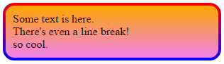
}<p class="grounded-radiants">
Some text is here.<br/>
There's even a line break!<br/>
so cool.
</p>El estilo adicional anterior es mostrar:
- Esto funciona con cualquier fondo
- Funciona bien con
box-shadow,inseto no - No requiere que agregue la sombra al pseudo-elemento
De nuevo, esto funciona con los navegadores IE, Firefox y Webkit/Blink.
Warning: date(): Invalid date.timezone value 'Europe/Kyiv', we selected the timezone 'UTC' for now. in /var/www/agent_stack/data/www/ajaxhispano.com/template/agent.layouts/content.php on line 61
2015-03-24 02:08:12
Qué pasa si aplicas el degradado al fondo. Que y añadir un div adicional en el interior, con el margen establecido en el antiguo borde-ancho y con un fondo blanco, y por supuesto un borderradius. De esa manera usted tiene el efecto de un borde, pero en realidad está utilizando fondo, que se recorta correctamente.
Warning: date(): Invalid date.timezone value 'Europe/Kyiv', we selected the timezone 'UTC' for now. in /var/www/agent_stack/data/www/ajaxhispano.com/template/agent.layouts/content.php on line 61
2011-04-18 18:46:12
Esto siempre funciona para mí en WebKit, aunque es un poco complicado!
Básicamente solo haces que el borde sea más grande y luego lo enmascaras con bordes de pseudo-elemento más grandes y más pequeños : ).
.thing {
  display: block;
  position: absolute;
  left: 50px;
  top: 50px;
  margin-top: 18pt;
  padding-left: 50pt;
  padding-right: 50pt;
  padding-top: 25pt;
  padding-bottom: 25pt;
  border-radius: 6px;
  font-size: 18pt;
  background-color: transparent;
  border-width: 3pt;
  border-image: linear-gradient(#D9421C, #E8A22F) 14% stretch;
}
.thing::after {
  content: '';
  border-radius: 8px;
  border: 3pt solid #fff;
  width: calc(100% + 6pt);
  height: calc(100% + 6pt);
  position: absolute;
  top: -6pt;
  left: -6pt;
  z-index: 900;
}
.thing::before {
  content: '';
  border-radius: 2px;
  border: 1.5pt solid #fff;
  width: calc(100%);
  height: calc(100% + 0.25pt);
  position: absolute;
  top: -1.5pt;
  left: -1.5pt;
  z-index: 900;
}
Warning: date(): Invalid date.timezone value 'Europe/Kyiv', we selected the timezone 'UTC' for now. in /var/www/agent_stack/data/www/ajaxhispano.com/template/agent.layouts/content.php on line 61
2013-11-12 04:57:43
Usaría SVG para esto:
<svg xmlns="http://www.w3.org/2000/svg" viewBox="0 0 220 220" width="100%" height="100%" preserveAspectRatio="none">
  <defs>
    <linearGradient id="gradient">
      <stop offset="0" style="stop-color:#0070d8" />
      <stop offset="0.5" style="stop-color:#2cdbf1" />
      <stop offset="1" style="stop-color:#83eb8a" />
    </linearGradient>
  </defs>
  <ellipse ry="100" rx="100" cy="110" cx="110" style="fill:none;stroke:url(#gradient);stroke-width:6;" />
</svg>
SVG se puede usar como archivo separado (forma preferida) o como parte del valor de background (el código a continuación solo funcionará en los navegadores webkit):
div {
  width: 250px;
  height: 250px;
  background: url('data:image/svg+xml;utf8,<svg xmlns="http://www.w3.org/2000/svg" viewBox="0 0 220 220" width="100%" height="100%" preserveAspectRatio="none"><defs><linearGradient id="gradient"><stop offset="0" style="stop-color:#0070d8" /><stop offset="0.5" style="stop-color:#2cdbf1" /><stop offset="1" style="stop-color:#83eb8a" /></linearGradient></defs><ellipse ry="100" rx="100" cy="110" cx="110" style="fill:none;stroke:url(#gradient);stroke-width:6;" /></svg>');
}<div></div>Para que esto funcione en MS Edge y Firefox debemos escapar de nuestro marcado después de utf8, por lo que reemplazaremos las comillas dobles " con comillas simples', # con %23 y % con %25:
div {
  width: 250px;
  height: 250px;
  background: url("data:image/svg+xml;utf8,<svg xmlns='http://www.w3.org/2000/svg' viewBox='0 0 220 220' width='100%25' height='100%25' preserveAspectRatio='none'><defs><linearGradient id='gradient'><stop offset='0' style='stop-color:%230070d8' /><stop offset='0.5' style='stop-color:%232cdbf1' /><stop offset='1' style='stop-color:%2383eb8a' /></linearGradient></defs><ellipse ry='100' rx='100' cy='110' cx='110' style='fill:none;stroke:url(%23gradient);stroke-width:6;' /></svg>");
  background-size: 100% 100%; /* Fix for Fifefox image scaling */
}<div></div>Warning: date(): Invalid date.timezone value 'Europe/Kyiv', we selected the timezone 'UTC' for now. in /var/www/agent_stack/data/www/ajaxhispano.com/template/agent.layouts/content.php on line 61
2017-06-25 14:21:37
Soluciones para elementos transparentes : trabajando al menos en Firefox.
En realidad hay una forma que encontré sin pseudo clases - pero solo funciona para gradientes radiales:
body {
  background: linear-gradient(white, black), -moz-linear-gradient(white, black), -webkit-linear-gradient(white, black);
  height: 300px;

  }

div{
text-align: center;
  width: 100px;
  height: 100px;
  font-size:30px;
  color: lightgrey;
  border-radius: 80px;
  color: transparent;
  background-clip: border-box, text;
  -moz-background-clip: border-box, text;
  -webkit-background-clip: border-box, text;
  background-image: radial-gradient(circle,
      transparent, transparent 57%, yellow 58%, red 100%), repeating-linear-gradient(-40deg, yellow,
  yellow 10%, orange 21%, orange 30%, yellow 41%);
  line-height: 100px;
}
<body>
<div class="radial-gradient"> OK </div>
</body>Obtener un elemento transparente con pseudo clases solo encontré de esta manera-ok no es un gradiente, pero es al menos un borde rayado multicolor (que parece anillos de vida):
body {
  background: linear-gradient(white, black, white);
  height: 600px;
  }

div{
  position: absolute;
  width: 100px;
  height: 100px;
  font-size:30px;
  background-color:transparent;
  border-radius:80px;
  border: 10px dashed orange;
  color: transparent;
  background-clip: text;
  -moz-background-clip: text;
  -webkit-background-clip: text;
  background-image: repeating-linear-gradient(-40deg, yellow,
  yellow 10%, orange 11%, orange 20%, yellow 21%);
  text-align:center;
  line-height:100px;
}


div::after {
    position: absolute;
    top: -10px; bottom: -10px;
    left: -10px; right: -10px;
    border: 10px solid yellow;
    content: '';
    z-index: -1;
    border-radius: 80px;
    }
<body>
<div class="gradient"> OK </div>
</body>Con un svg (más satisfactorio en términos de variabilidad, pero también necesita la mayoría de las codelinas):
body{
  margin: 0;
  padding: 0;
}

div {
  position: absolute;
  display: flex;
  align-items: center;
  left: 50%;
  transform: translateX(-50%);
  text-align: center;
}

span {
  position: absolute;
  left: 50%;
  transform: translateX(-50%);
  width: 100px;
  height: 100px;
  line-height: 105px;
  font-size:40px;
  background-clip: text;
  -moz-background-clip: text;
  -webkit-background-clip: text;
  background-image: repeating-linear-gradient(-40deg, yellow,
  yellow 10%, orange 11%, orange 20%, yellow 21%);
  color: transparent;
}

svg {
  fill: transparent;
  stroke-width: 10px;
  stroke:url(#gradient);

}
<head>
</head>
<body>
<div>
<span>OK</span>
<svg>
<circle class="stroke-1" cx="50%" cy="50%" r="50"/>
<defs>
<linearGradient id="gradient" x1="0%" y1="0%" x2="0%" y2="15%" gradientTransform="rotate(-40)" spreadMethod="reflect">
<stop offset="0%" stop-color="orange" />
<stop offset="49%" stop-color="orange" />
<stop offset="50%" stop-color="yellow" />
<stop offset="99%" stop-color="yellow" />
</linearGradient>
</defs>
</svg>
</div>
</body>Warning: date(): Invalid date.timezone value 'Europe/Kyiv', we selected the timezone 'UTC' for now. in /var/www/agent_stack/data/www/ajaxhispano.com/template/agent.layouts/content.php on line 61
2018-03-09 09:37:45
Esta alternativa es bastante nueva: https://github.com/bfintal/jQuery.IE9Gradius.js
Simplemente incluya el último script en su etiqueta head y debería manejar el resto. Ver notas readme
Warning: date(): Invalid date.timezone value 'Europe/Kyiv', we selected the timezone 'UTC' for now. in /var/www/agent_stack/data/www/ajaxhispano.com/template/agent.layouts/content.php on line 61
2011-09-14 10:32:06