¿Cómo puedo hacer un carrusel de imágenes solo con CSS?
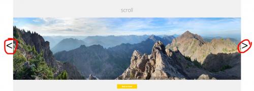
Estoy buscando hacer un carrusel de imágenes, donde un usuario puede alternar entre imágenes, haciendo clic en las flechas. Por ejemplo:
Sin embargo, solo puedo usar HTML y CSS, sin JavaScript (y, por lo tanto, jQuery). Solo necesito la configuración básica; las transiciones suaves y similares no son necesarias.
¿Cómo puedo lograr esto?
6 answers
¡Eso es fácil! Solo usa botones de opción y etiquetas específicas.
Los botones de opción tienen el comportamiento (necesario) de permitir que solo se seleccione uno al mismo tiempo, al igual que una imagen en nuestro carrusel.
Demo
div.wrap2 {
  float: left;
  height: 500px;
  width: 422px;
}
div.group input {
  display: none;
  left: -100%;
  position: absolute;
  top: -100%;
}
div.group input ~ div.content {
  border: solid 1px black;
  display: none;
  height: 350px;
  margin: 0px 60px;
  position: relative;
  width: 300px;
}
div.group input:checked ~ div.content {
  display: block;
}
div.group input:checked ~ label.previous,
div.group input:checked ~ label.next {
  display: block;
}
div.group label {
  background-color: #69c;
  border: solid 1px black;
  display: none;
  height: 50px;
  width: 50px;
}
img {
  left: 0;
  margin: 0 auto;
  position: absolute;
  right: 0;
}
p {
  text-align: center;
}
label {
  font-size: 4em;
  margin: 125px 0 0 0;
}
label.previous {
  float: left;
  padding: 0 0 30px 5px;
}
label.next {
  float: right;
  padding: 0 5px 25px 0;
  text-align: right;
}
<div class="wrap">
<div class="wrap2">
<div class="group">
<input type="radio" name="test" id="0" value="0">
<label for="4" class="previous"><</label>
<label for="1" class="next">></label>
<div class="content">
<p>panel #0</p>
<img src="http://i.stack.imgur.com/R5yzx.jpg" width="200" height="286">
</div>
</div>
<div class="group">
<input type="radio" name="test" id="1" value="1">
<label for="0" class="previous"><</label>
<label for="2" class="next">></label>
<div class="content">
<p>panel #1</p>
<img src="http://i.stack.imgur.com/k0Hsd.jpg" width="200" height="139">
</div>
</div>
<div class="group">
<input type="radio" name="test" id="2" value="2">
<label for="1" class="previous"><</label>
<label for="3" class="next">></label>
<div class="content">
<p>panel #2</p>
<img src="http://i.stack.imgur.com/Hhl9H.jpg" width="140" height="200">
</div>
</div>
<div class="group">
<input type="radio" name="test" id="3" value="3" checked="">
<label for="2" class="previous"><</label>
<label for="4" class="next">></label>
<div class="content">
<p>panel #3</p>
<img src="http://i.stack.imgur.com/r1AyN.jpg" width="200" height="287">
</div>
</div>
<div class="group">
<input type="radio" name="test" id="4" value="4">
<label for="3" class="previous"><</label>
<label for="0" class="next">></label>
<div class="content">
<p>panel #4</p>
<img src="http://i.stack.imgur.com/EHHsa.jpg" width="96" height="139">
</div>
</div>
</div>
</div>TLDR: Notas importantes
- Asegúrese de que al menos uno
input(type="radio")escheckedpor defecto, o el carrusel completo estará oculto. - Ocultar los radios de entrada y utilizar etiquetas como el anterior/siguiente botones
- Asegúrese de que
labelsapunte correctamente a la entrada de radio anterior/siguiente (consulte la sección etiquetas al final sobre cómo hacer la segmentación) - Mostrar una imagen cuando su radio de entrada correspondiente es
:checked - Use imágenes de gatitos lindos
Explicación
Así debería ser la estructura HTML básica:
div#holder
    div.group
        input(type="radio")
        label.previous
        label.next
        div.content
            img
    div.group
        // ... repeat as necessary
div#holder mantendrá todo nuestro contenido en su lugar. Luego, agruparemos nuestros botones de opción, etiquetas e imágenes bajo un div.group. Esto asegura que nuestras entradas de radio no sufran de interferencia destructiva (juego de palabras).
La clave está en los selectores (y las etiquetas-asegúrese de leer esa sección)
Primero, esconderemos nuestros botones de radio-de todos modos son feos: {[32]]}
div.group input {
    display: none;
    position: absolute;
    top: -100%;
    left: -100%;
}
Nunca tendremos que hacer clic en los botones de opción. En su lugar, vamos a estilo nuestras etiquetas y añadir destinos (for propiedades), de modo que redirigen el clic al bloque de entrada de radio apropiado.
La mayoría de nuestras etiquetas deben ser oculto:
div.group label {
    display: none;
}
(Omitiré todo el estilo estético, para que el estilo sea más fácil de entender. Puede ver la versión más atractiva en el fragmento de pila.)
Excepto para los que están junto a una entrada de radio que está activada, o :checked
div.group input:checked ~ label.previous,
div.group input:checked ~ label.next {
    display: block;
}
Además, el div.content después de una entrada marcada también debe mostrarse:
div.group input:checked ~ div.content {
    display: block;
}
Sin embargo, cuando el botón de opción no está marcado, div.content debe ocultarse:
div.group input ~ div.content {
    display: none;
    position: relative;
}
label.previous { float: left; }
label.next { float: right; }
Y centrar nuestras imágenes dentro de sus respectivos divs:
img {
    left: 0;
    margin: 0 auto;
    position: absolute;
    right: 0;
}
El último paso es cómo configurar sus etiquetas:
<input type="radio" id="1">
<label class="previous" for="0"><</label>
<label class="next" for="2">></label>
Tenga en cuenta cómo, dada una entrada de radio con un id de n, el label.previous tendrá un atributo for de (n - 1) % M y el label.next tendrá un atributo for de (n + 1) % M, donde M es el número de imágenes carrusel.
Extra
Si estás usando Jade (o algún otro motor de plantillas), puedes configurarlo con un simple bucle for como este:
div.wrap2
- var imgs = [[200, 286], [200, 139], [140, 200], [200, 287], [96, 139]];
- for (var i = 0; i < imgs.length; i++)
div.group
input(type="radio" name="test" id="#{i}" value="#{i}" checked="#{input == 3}")
label(for="#{(i - 1 + imgs.length) % imgs.length}").previous <
label(for="#{(i + 1) % imgs.length}").next >
div.content
p panel ##{i}
img(src="http://placekitten.com/g/#{imgs[i].join('/')}"
height="#{imgs[i][1]}"
width="#{imgs[i][0]}"
)
Warning: date(): Invalid date.timezone value 'Europe/Kyiv', we selected the timezone 'UTC' for now. in /var/www/agent_stack/data/www/ajaxhispano.com/template/agent.layouts/content.php on line 61
2015-07-19 08:16:31
Note, css below does not meet the specific requirement at Question
Donde un usuario puede alternar entre imágenes, haciendo clic en las flechas.
Utiliza :target pseudo clase , miniaturas como controles para alternar entre imágenes; modelado según el patrón descrito en Cómo Activar transiciones CSS3 al hacer clic usando: target
body {
  width: 70%;
  overflow: hidden;
}

section {
  position: relative;
  display: block;
  left: calc(50%);
}
/* set `div` container `background` to last `div img` `src` */
div {
  display: inline-block;
  position: relative;
  height: 100px;
  width: 100px;
  background: url(http://lorempixel.com/100/100/cats);
  border: 0.1em outset black;
}
/* set `img` `opacity:0`  */
div img {
  position: absolute;
  transition: all 500ms ease-in-out;
  -moz-transition: all 500ms ease-in-out;
  -webkit-transition: all 500ms ease-in-out;
  -o-transition: all 500ms ease-in-out;
  -ms-transition: all 500ms ease-in-out;
  opacity: 0;
}
/*
   display `:target` `img` on click of `a`,
   having `img` as fragment identifier
*/
div img:target {
  opacity: 1;
  animation: active 1s ease-in-out 0s normal 1 both;
  -moz-animation: active 1s ease-in-out 0s normal 1 both;
  -webkit-animation: active 1s ease-in-out 0s normal 1 both;
}
/* `.thumbs` `span` elements */
.thumbs {
  height: 25px;
  width: 25px;
  padding: 1px;
  display: inline-block;
  position: relative;
  text-align: center;
  border: 0.1em inset black;
  border-radius: 50px;
  font-size: 1em;
}
/* set `background` of `.thumbs` `span` elements  */
[href="#3"] .thumbs {
  background: url(http://lorempixel.com/100/100/cats);
  background-size: 100%;
  background-repeat: no-repeat;
}

[href="#2"] .thumbs {
  background: url(http://lorempixel.com/100/100/animals);
  background-size: 100%;
  background-repeat: no-repeat;
}

[href="#1"] .thumbs {
  background: url(http://lorempixel.com/100/100/technics);
  background-size: 100%;
  background-repeat: no-repeat;
}

[href="#0"] .thumbs {
  background: url(http://lorempixel.com/100/100/nature);
  background-size: 100%;
  background-repeat: no-repeat;
}

span:hover {
  border-top: 0.1em solid gold;
  border-left: 0.1em solid yellow;
  border-bottom: 0.1em solid orange;
  border-right: 0.1em solid goldenrod;
  box-shadow: 0 0 0 0.125em sienna, 0 0 0 0.225em dodgerblue;
}

a {
  top: 30%;
  text-decoration: none;
  display: inline-block;
  position: relative;
  color: transparent;
}

nav a {
  left: -16px;
}

@keyframes active {
  0% {
    box-shadow: 0 0 0 0.125em dodgerblue, 0 0 0 0.25em yellow;
  }
  100% {
    box-shadow: none;
  }
}

@-webkit-keyframes active {
  0% {
    box-shadow: 0 0 0 0.125em dodgerblue, 0 0 0 0.25em yellow;
  }
  100% {
    box-shadow: none;
  }
}

@-moz-keyframes active {
  0% {
    box-shadow: 0 0 0 0.125em dodgerblue, 0 0 0 0.25em yellow;
  }
  100% {
    box-shadow: none;
  }
}
<section>
<div>
<img src="http://lorempixel.com/100/100/nature" id="0" />
<img src="http://lorempixel.com/100/100/technics" id="1" />
<img src="http://lorempixel.com/100/100/animals" id="2" />
<img src="http://lorempixel.com/100/100/cats" id="3" />
</div>
<nav>
<a href="#3">
<span class="thumbs">
</span>
</a>
<a href="#2">
<span class="thumbs">
</span>
</a>
<a href="#1">
<span class="thumbs">
</span>
</a>
<a href="#0">
<span class="thumbs">
</span>
</a>
</nav>
</section>Warning: date(): Invalid date.timezone value 'Europe/Kyiv', we selected the timezone 'UTC' for now. in /var/www/agent_stack/data/www/ajaxhispano.com/template/agent.layouts/content.php on line 61
2015-07-23 04:39:40
Inspirado por royhowie terminé con una solución mucho más simple si se trata de sintaxis HTML. Además, con una bonita animación y totalmente personalizable!
La idea principal era crear las flechas no colocándolas en HTML una por una, sino creando y luego colocando cuidadosamente pseudoelementos.
* {
    -ms-box-sizing: border-box;
    -moz-box-sizing: border-box;
    -webkit-box-sizing: border-box;
    box-sizing: border-box;
}

.CSS_slideshow {
    display: block;
    width: 600px;
    height: 425px;
    overflow: hidden;
    margin: 0 auto;
    -ms-user-select: none;
    -moz-user-select: none;
    -webkit-user-select: none;
    user-select: none;
    text-space-collapse: trim-inner;
}
.CSS_slideshow[data-show-indicators="true"][data-indicators-position="in"] {
    -webkit-margin-after: -25px; /* Removes the space under the slideshow. Webkit only as only Webkit-based browsers will support the dots in the wrapper */
}
/* Defines animation timing function */
.CSS_slideshow[data-animation-style] {
    -moz-transition-timing-function: ease-in-out;
    -webkit-transition-timing-function: ease-in-out;
    transition-timing-function: ease-in-out;
}
    /* Inherit all animation properties from parent element */
    .CSS_slideshow[data-animation-style] *,
    .CSS_slideshow[data-show-buttons="true"][data-animation-style] label:before,
    .CSS_slideshow[data-show-buttons="true"][data-animation-style] label:after {
        -moz-transition-duration: inherit;
        -webkit-transition-duration: inherit;
        transition-duration: inherit;
        -moz-transition-timing-function: inherit;
        -webkit-transition-timing-function: inherit;
        transition-timing-function: inherit;
    }
    /* WRAPPER */
    .CSS_slideshow_wrapper {
        display: block;
        width: 600px;
        height: 400px;
        position: relative;
        /* Styling */
        text-align: center;
    }
        /* Indicators */
        .CSS_slideshow[data-show-indicators="true"] input {
            width: 10px;
            height: 10px;
            outline: none;
            position: relative;
            top: calc(100% + 7px);
            -ms-transform: scale(1); /* Fallback for Internet Explorer: supports radio button resizing, does not support :after. Not necessary, put for readibility. */
            -moz-transform: scale(0.6); /* Fallback for Firefox: does not radio button resizing, does not support :after */
            -webkit-appearance: none; /* hide radio buttons for Webkit: supports :after */
        }
        .CSS_slideshow[data-show-indicators="true"] input:checked {
            -ms-transform: scale(1.25); /* Fallback for Internet Explorer: supports radio button resizing, does not support :after */
            -moz-transform: scale(0.9); /* Fallback for Firefox: it does not do radio button resizing, does not support :after */
        }
        /* Webkit-only goodness - for now */
        .CSS_slideshow[data-show-indicators="true"] input:after {
            content: '';
            display: block;
            position: absolute;
            left: 0;
            width: 8px;
            height: 8px;
            border: 1px solid;
            border-radius: 100%;
            cursor: pointer;
            z-index: 4;
            -moz-transition-property: transform, background;
            -webkit-transition-property: transform, background;
            transition-property: transform, background;
        }
        .CSS_slideshow[data-show-indicators="true"][data-indicators-position="under"] input:after {
            top: -2px;
            background: rgba(0, 0, 0, 0);
            border-color: rgb(0, 0, 0);
        }
        .CSS_slideshow[data-show-indicators="true"][data-indicators-position="in"] input:after {
            top: -35px;
            box-shadow: inset 0 0 2px rgba(0, 0, 0, 0.25), 0 0 2px rgba(0, 0, 0, 0.25);
            background: rgba(235, 235, 235, 0);
            border-color: rgb(235, 235, 235);
        }
        .CSS_slideshow[data-show-indicators="true"] input:checked:after {
            -webkit-transform: scale(1.25);
        }
        .CSS_slideshow[data-show-indicators="true"][data-indicators-position="under"] input:checked:after {
            background: rgb(0, 0, 0)
        }
        .CSS_slideshow[data-show-indicators="true"][data-indicators-position="in"] input:checked:after {
            box-shadow: 0 0 2px rgba(0, 0, 0, 0.25);
            background: rgb(235, 235, 235);
        }
        .CSS_slideshow:not([data-show-indicators="true"]) input {
            display: none;
        }
        /* SLIDES */
        .CSS_slideshow label {
            display: inline-block;
            width: 100%;
            height: 100%;
            position: absolute;
            top: 0;
        }
        .CSS_slideshow[data-animation-style="slide"] label {
            -moz-transition-property: left;
            -webkit-transition-property: left;
            transition-property: left;
        }
        .CSS_slideshow label img {
            width: 100%;
            height: 100%;
        }
        /* Puts all the slides on the left... */
        .CSS_slideshow label {
            left: -100%;
        }
        /* ...except the ones coming after input:checked - those are put on the right... */
        .CSS_slideshow input:checked ~ label {
            left: 100%;
        }
        /* ...except the one coming directly after input:checked - this is our current slide and it's in the middle */
        .CSS_slideshow input:checked + label {
            left: 0;
        }
            /* PREV/NEXT ARROWS */
            .CSS_slideshow[data-show-buttons="true"] label:before,
            .CSS_slideshow[data-show-buttons="true"] label:after {
                display: block;
                position: absolute;
                width: 60px;
                height: 60px;
                top: calc((100% - 60px) / 2);
                /* Styling */
                background: rgb(235, 235, 235);
                font-size: 35px;
                font-weight: 800;
                font-family: Consolas;
                line-height: 56px;
                color: black;
                z-index: 1;
                cursor: pointer;
            }
            .CSS_slideshow[data-show-buttons="true"][data-animation-style="slide"] label:before,
            .CSS_slideshow[data-show-buttons="true"][data-animation-style="slide"] label:after {
                -moz-transition-property: left, right;
                -webkit-transition-property: left, right;
                transition-property: left, right;
            }
            .CSS_slideshow[data-show-buttons="true"] label:hover:before,
            .CSS_slideshow[data-show-buttons="true"] label:hover:after {
                /* Styling */
                background: rgb(245, 245, 245);
            }
            /* Slides on the left */
            /* Since the slides are on the left, we need to move the buttons 100% to the right */
            .CSS_slideshow[data-show-buttons="true"] label:before {
                right: -100%;
                opacity: 0;
                /* Styling */
                content: '>'; /* next */
            }
            .CSS_slideshow[data-show-buttons="true"] label:after {
                left: 100%;
                opacity: 1;
                /* Styling */
                content: '<'; /* previous */
            }
            /* Slides on the right */
            /* Since the slides are on the right, we need to move the buttons 100% to the left */
            .CSS_slideshow[data-show-buttons="true"] input:checked ~ label:before {
                right: 100%;
                opacity: 1;
            }
            .CSS_slideshow[data-show-buttons="true"] input:checked ~ label:after {
                left: -100%;
                opacity: 0;
                cursor: default;
            }
            /* Active slide */
            /* And for the active slide - just usual positioning */
            .CSS_slideshow[data-show-buttons="true"] input:checked + label:before {
                right: 0;
                opacity: 0;
                cursor: default;
            }
            .CSS_slideshow[data-show-buttons="true"] input:checked + label:after {
                left: 0;
            }
            /* Buttons positioning */
            .CSS_slideshow[data-show-buttons="true"] label:after {
                z-index: 3; /* move "previous" buttons forward... */
            }
            .CSS_slideshow[data-show-buttons="true"] input:checked ~ label:after {
                z-index: 1; /* ...except the one for an active slide - this should be hidden - causes the "previous" arrow from the previous slide to be on top */
            }
            .CSS_slideshow[data-show-buttons="true"] input:checked + label + input + label:before {
                z-index: 3; /* move "next" button one slide ahead forward - causes the "next" arrow from the next slide to be on top */
            }
            /* WRAP ARROWS */
            /* We'll reuse "previous" arrow from the first slide and "next" arrow from the last to make "wrap" buttons, based on roughly the same principles */
            .CSS_slideshow[data-show-buttons="true"][data-show-wrap-buttons="true"] label:first-of-type:before,
            .CSS_slideshow[data-show-buttons="true"][data-show-wrap-buttons="true"] label:last-of-type:after {
                z-index: 2 !important;
                opacity: 1 !important;
                cursor: pointer !important;
                /* Styling */
                letter-spacing: -9px;
                text-align: left;
                padding-left: 14px;
                width: 46px;
            }
            .CSS_slideshow[data-show-buttons="true"][data-show-wrap-buttons="true"] label:first-of-type:before {
                content: '<<'; /* jump to first */
                right: 0 !important;
            }
            .CSS_slideshow[data-show-buttons="true"][data-show-wrap-buttons="true"] input:not(:checked) + label:first-of-type:before {
                right: -100% !important;
            }
            .CSS_slideshow[data-show-buttons="true"][data-show-wrap-buttons="true"] label:last-of-type:after {
                content: '>>'; /* jump to last */
                left: 0 !important;
            }
            .CSS_slideshow[data-show-buttons="true"][data-show-wrap-buttons="true"] input:not(:checked) + label:last-of-type:after {
                left: -100% !important;
            }


/* Non-CSS slideshow CSS */
body {
    font-family: Segoe UI, Tahoma, sans-serif;
    font-size: 14px;
}

#license {
    margin-top: 3em;
    text-align: center;
    font-size: 10px;
}
    #license * {
        font-size: 10px;
    }
<div
class="CSS_slideshow"
data-show-indicators="true"
data-indicators-position="in"
data-show-buttons="true"
data-show-wrap-buttons="true"
data-animation-style="slide"
style="-moz-transition-duration: 0.3s; -webkit-transition-duration: 0.3s; transition-duration: 0.3s;"
>
<div class="CSS_slideshow_wrapper">
<input type="radio" name="css3slideshow" id="slide1" checked /><!--
--><label for="slide1"><img src="https://placekitten.com/g/602/400" /></label><!--
--><input type="radio" name="css3slideshow" id="slide2" /><!--
--><label for="slide2"><img src="https://placekitten.com/g/605/400" /></label><!--
--><input type="radio" name="css3slideshow" id="slide3" /><!--
--><label for="slide3"><img src="https://placekitten.com/g/600/400" /></label><!--
--><input type="radio" name="css3slideshow" id="slide4" /><!--
--><label for="slide4"><img src="https://placekitten.com/g/603/400" /></label><!--
--><input type="radio" name="css3slideshow" id="slide5" /><!--
--><label for="slide5"><img src="https://placekitten.com/g/604/400" /></label>
</div>
</div>
<div id="license">
<a rel="license" href="http://creativecommons.org/licenses/by-sa/4.0/"><img alt="Creative Commons License" style="border-width:0" src="https://i.creativecommons.org/l/by-sa/4.0/88x31.png" /></a><br /><span xmlns:dct="http://purl.org/dc/terms/" href="http://purl.org/dc/dcmitype/InteractiveResource" property="dct:title" rel="dct:type">Pure CSS slideshow</span> by <a xmlns:cc="http://creativecommons.org/ns#" href="http://wojtekmaj.pl" property="cc:attributionName" rel="cc:attributionURL">Wojciech Maj</a> is licensed under a <a rel="license" href="http://creativecommons.org/licenses/by-sa/4.0/">Creative Commons Attribution-ShareAlike 4.0 International License</a>.
</div>JSFiddle
Puede leer más sobre personalizaciones y algunas limitaciones técnicas en my fiddle.
Warning: date(): Invalid date.timezone value 'Europe/Kyiv', we selected the timezone 'UTC' for now. in /var/www/agent_stack/data/www/ajaxhispano.com/template/agent.layouts/content.php on line 61
2015-07-19 08:28:50
Por favor, compruebe este enlace para CSS carrusel solo con la opción de reproducción automática en el principio, Botones de navegación izquierda Derecha, puntos de navegación, y reanuda jugar cuando se hace clic en el botón...
Enlace de demostración- http://blog.puneets.in/2016/02/pure-responsive-css3-slider-with.html
.csslider1 {
		display: inline-block;
		position: relative;
		max-width: 830px;

		width: 100%;
		margin-top: 10px;
	}
	.csslider1 > .cs_anchor {
		display: none;
	}
	.csslider1 > ul {
		position: relative;
		z-index: 1;
		font-size: 0;
		line-height: 0;
		margin: 0 auto;
		padding: 0;

		overflow: hidden;
		white-space: nowrap;
	}
	.csslider1 > ul > div {
		width: 100%;
		visibility: hidden;
		font-size: 0px;
		line-height: 0;
	}
	.csslider1 > ul > li.img img {
		width: 100%;
	}
	.csslider1 > ul > li.img {
		font-size: 0pt;
	}
	.csslider1 > ul > li {
		position: relative;
		display: inline-block;
		width: 100%;
		height: 100%;
		overflow: hidden;
		font-size: 15px;
		font-size: initial;
		line-height: normal;
		white-space: normal;
		vertical-align: top;
		-webkit-box-sizing: border-box;
		-moz-box-sizing: border-box;
		box-sizing: border-box;

		-webkit-transform: translate3d(0,0,0);
		-moz-transform: translate3d(0,0,0);
		-ms-transform: translate3d(0,0,0);
		-o-transform: translate3d(0,0,0);
		transform: translate3d(0,0,0);
	}
	.csslider1 .cs_lnk{
		position: absolute;
		top: -9999px;
		left: -9999px;
		font-size: 0pt;
		opacity: 0;
		filter: alpha(opacity=0);
	}

	.csslider1 > ul > li.img,
	.csslider1 > .cs_arrowprev,
	.csslider1 > .cs_arrownext,
	.csslider1 > .cs_bullets,
	.csslider1 > .cs_play_pause {
		-webkit-touch-callout: none;
		-webkit-user-select: none;
		-khtml-user-select: none;
		-moz-user-select: none;
		-ms-user-select: none;
		user-select: none;
	}.csslider1 > .cs_arrowprev,
	.csslider1 > .cs_arrownext {
		position: absolute;
		top: 50%;
		-webkit-box-sizing: content-box;
		-moz-box-sizing: content-box;
		box-sizing: content-box;
		z-index: 5;
	}
	.csslider1 > .cs_arrowprev > label,
	.csslider1 > .cs_arrownext > label {
		position: absolute;

		text-decoration: none;
		cursor: pointer;
		opacity: 0;
		z-index: -1;
	}
	.csslider1 > .cs_arrowprev {
		left: 0;
	}
	.csslider1 > .cs_arrownext {
		right: 0;
	}

	.csslider1 > .slide:checked ~ .cs_arrowprev > label,
	.csslider1 > .slide:checked ~ .cs_arrownext > label {
		opacity: 0;
		z-index: -1;
	}

	.csslider1 > #cs_slide1_0:checked ~ .cs_arrowprev > label.num2,
	.csslider1 > #cs_pause1_0:checked ~ .cs_arrowprev > label.num2,
	.csslider1 > #cs_slide1_0:checked ~ .cs_arrownext > label.num1,
	.csslider1 > #cs_pause1_0:checked ~ .cs_arrownext > label.num1,
	.csslider1 > #cs_slide1_1:checked ~ .cs_arrowprev > label.num0,
	.csslider1 > #cs_pause1_1:checked ~ .cs_arrowprev > label.num0,
	.csslider1 > #cs_slide1_1:checked ~ .cs_arrownext > label.num2,
	.csslider1 > #cs_pause1_1:checked ~ .cs_arrownext > label.num2,
	.csslider1 > #cs_slide1_2:checked ~ .cs_arrowprev > label.num1,
	.csslider1 > #cs_pause1_2:checked ~ .cs_arrowprev > label.num1,
	.csslider1 > #cs_slide1_2:checked ~ .cs_arrownext > label.num0,
	.csslider1 > #cs_pause1_2:checked ~ .cs_arrownext > label.num0 {
		opacity: 1;
		z-index: 5;
	}

	@-webkit-keyframes arrow {
		0%, 33.32333333333334% { opacity: 1; z-index: 5; }
		33.333333333333336%, 100%	{ opacity: 0; z-index: -1; }
	}
	@-moz-keyframes arrow {
		0%, 33.32333333333334% { opacity: 1; z-index: 5; }
		33.333333333333336%, 100%	{ opacity: 0; z-index: -1; }
	}
	@keyframes arrow {
		0%, 33.32333333333334% { opacity: 1; z-index: 5; }
		33.333333333333336%, 100%	{ opacity: 0; z-index: -1; }
	}


	.csslider1 > #cs_play1:checked ~ .cs_arrowprev > label.num2,
	.csslider1 > #cs_play1:checked ~ .cs_arrownext > label.num1 {
		-webkit-animation: arrow 12300ms infinite -1000ms;
		-moz-animation: arrow 12300ms infinite -1000ms;
		animation: arrow 12300ms infinite -1000ms;

	}
	.csslider1 > #cs_play1:checked ~ .cs_arrowprev > label.num0,
	.csslider1 > #cs_play1:checked ~ .cs_arrownext > label.num2 {
		-webkit-animation: arrow 12300ms infinite 3100ms;
		-moz-animation: arrow 12300ms infinite 3100ms;
		animation: arrow 12300ms infinite 3100ms;

	}
	.csslider1 > #cs_play1:checked ~ .cs_arrowprev > label.num1,
	.csslider1 > #cs_play1:checked ~ .cs_arrownext > label.num0 {
		-webkit-animation: arrow 12300ms infinite 7200ms;
		-moz-animation: arrow 12300ms infinite 7200ms;
		animation: arrow 12300ms infinite 7200ms;

	}

	.csslider1 > .slide:checked ~ .cs_arrowprev > label,
	.csslider1 > .slide:checked ~ .cs_arrownext > label,
	.csslider1 > .pause:checked ~ .cs_arrowprev > label,
	.csslider1 > .pause:checked ~ .cs_arrownext > label {
		-webkit-animation: none;
		-moz-animation: none;
		-ms-animation: none;
		-o-animation: none;
		animation: none;
	}

	.csslider1 > .cs_bullets {
		position: absolute;
		left: 0;
		width: 100%;
		z-index: 6;
		font-size: 0;
		line-height: 8pt;
		text-align: center;
	}
	.csslider1 > .cs_bullets > div {
		margin-left: -50%;
		width: 100%;
	}
	.csslider1 > .cs_bullets > label {
		position: relative;
		display: inline-block;
		cursor: pointer;
	}
	.csslider1 > .cs_bullets > label > .cs_thumb {
		visibility: hidden;
		position: absolute;
		opacity: 0;
		z-index: 1;
		line-height: 0;
		left: -55px;
		top: -48px;
	}
	.csslider1 > .cs_bullets > label > .cs_thumb > img {
		max-width: none;
	}
	.csslider1.cs_handle {
		cursor: -webkit-grab;
		cursor: -moz-grab;
		cursor: url("data:image/png;base64,iVBORw0KGgoAAAANSUhEUgAAACAAAAAgCAQAAADZc7J/AAAABGdBTUEAALGPC/xhBQAAACBjSFJNAAB6JgAAgIQAAPoAAACA6AAAdTAAAOpgAAA6mAAAF3CculE8AAAAAmJLR0QA/4ePzL8AAABwSURBVEjH7ZJBEsAgCAMT/v/n9NCOSqe2oD2yNx1JggB4BCEFWyFASP2KMQE7ywWhe/tTRGCGogLk02tFctiW/SUgaMyQG4PdPzDn31rQbMb8FiAXgvsEJNax1yVlVGAjA93apP3HFhZTGIqiKH7iADB6HxPlHdNVAAAAJXRFWHRkYXRlOmNyZWF0ZQAyMDE0LTA3LTA3VDEzOjQ5OjEwKzAyOjAwm7WiFAAAACV0RVh0ZGF0ZTptb2RpZnkAMjAxNC0wNy0wN1QxMzo0OToxMCswMjowMOroGqgAAAAASUVORK5CYII="), move;
	}
	.csslider1.cs_handle.cs_grab {
		cursor: -webkit-grabbing;
		cursor: -moz-grabbing;
		cursor: url("data:image/png;base64,iVBORw0KGgoAAAANSUhEUgAAACAAAAAgCAQAAADZc7J/AAAABGdBTUEAALGPC/xhBQAAACBjSFJNAAB6JgAAgIQAAPoAAACA6AAAdTAAAOpgAAA6mAAAF3CculE8AAAAAmJLR0QA/4ePzL8AAABaSURBVEjH7ZMxCkAhDEOT8u9/5TpJ+xWkFse8IYutJgEB8RCHL1qCc90BEFnT6QH7mwgFHBUf8wJyS1TDLuc3vmighx37LZdIth3E5hKj9n6O0HRh+oJCiFcMxRUUDxR1CTMAAAAldEVYdGRhdGU6Y3JlYXRlADIwMTQtMDctMDdUMTM6NDk6MzgrMDI6MDDqf+sOAAAAJXRFWHRkYXRlOm1vZGlmeQAyMDE0LTA3LTA3VDEzOjQ5OjM4KzAyOjAwmyJTsgAAAABJRU5ErkJggg=="), move;
	}

	.csslider1 > ul > li.num0 {
		left: 0%;
	}
	.csslider1 > ul > li.num1 {
		left: 100%;
	}
	.csslider1 > ul > li.num2 {
		left: 200%;
	}

	.csslider1 > #cs_slide1_0:checked ~ ul > li,
	.csslider1 > #cs_pause1_0:checked ~ ul > li {
		-webkit-transform: translateX(0%);
		-moz-transform: translateX(0%);
		transform: translateX(0%);

	}
	.csslider1 > #cs_slide1_1:checked ~ ul > li,
	.csslider1 > #cs_pause1_1:checked ~ ul > li {
		-webkit-transform: translateX(-100%);
		-moz-transform: translateX(-100%);
		transform: translateX(-100%);

	}
	.csslider1 > #cs_slide1_2:checked ~ ul > li,
	.csslider1 > #cs_pause1_2:checked ~ ul > li {
		-webkit-transform: translateX(-200%);
		-moz-transform: translateX(-200%);
		transform: translateX(-200%);

	}

	.csslider1 > ul > li {
		position: absolute;
		top: 0;
		left: 0;
		display: inline-block;
		opacity: 1;

		-webkit-transition: -webkit-transform 1000ms;
		-moz-transition: -moz-transform 1000ms;
		transition: transform 1000ms;


		-webkit-transform: scale(1);
		-moz-transform: scale(1);
		transform: scale(1);

	}


	@-webkit-keyframes slide {
		0%, 25.203252032520325%	{ -webkit-transform: translateX(0%); }
		33.333333333333336%, 58.53658536585366%	{ -webkit-transform: translateX(-100%); }
		66.66666666666667%, 91.869918699187%	{ -webkit-transform: translateX(-200%); }

	}
	@-moz-keyframes slide {
		0%, 25.203252032520325%	{ -moz-transform: translateX(0%); }
		33.333333333333336%, 58.53658536585366%	{ -moz-transform: translateX(-100%); }
		66.66666666666667%, 91.869918699187%	{ -moz-transform: translateX(-200%); }

	}
	@keyframes slide {
		0%, 25.203252032520325%	{ transform: translateX(0%); }
		33.333333333333336%, 58.53658536585366%	{ transform: translateX(-100%); }
		66.66666666666667%, 91.869918699187%	{ transform: translateX(-200%); }

	}


	.csslider1  > #cs_play1:checked ~ ul > li {
		-webkit-animation: slide 12300ms infinite;
		-moz-animation: slide 12300ms infinite;
		animation: slide 12300ms infinite;

	}


	.csslider1 > #cs_play1:checked ~ ul > li,
	.csslider1 > .pause:checked ~ ul > li {
		-webkit-transition: none;
		-moz-transition: none;
		transition: none;

	}


	/* /calculate autoplay */
	.csslider1 > .cs_arrowprev,
	.csslider1 > .cs_arrownext {
		top: 0;
		bottom: 0;
		width: 15%;
		opacity: .5;
	}
	.csslider1 > .cs_arrowprev:hover,
	.csslider1 > .cs_arrownext:hover {
		opacity: .9;
	}
	.csslider1 > .cs_arrowprev {
		left: 0;
		background-image: -webkit-linear-gradient(left, rgba(0,0,0,0.5) 0, rgba(0,0,0,0.0001) 100%);
		background-image: linear-gradient(to right, rgba(0,0,0,0.5) 0, rgba(0,0,0,0.0001) 100%);
		filter: progid:DXImageTransform.Microsoft.gradient(startColorstr='#80000000', endColorstr='#00000000', GradientType=1);
		background-repeat: repeat-x;
	}
	.csslider1 > .cs_arrownext {
		right: 0;
		background-image: -webkit-linear-gradient(left, rgba(0,0,0,0.0001) 0, rgba(0,0,0,0.5) 100%);
		background-image: linear-gradient(to right, rgba(0,0,0,0.0001) 0, rgba(0,0,0,0.5) 100%);
		filter: progid:DXImageTransform.Microsoft.gradient(startColorstr='#00000000', endColorstr='#80000000', GradientType=1);
		background-repeat: repeat-x;
	}

	.csslider1 > .cs_arrowprev > label,
	.csslider1 > .cs_arrownext > label {
		top: 0;
		left: 0;
		bottom: 0;
		width: 100%;
	}
	.csslider1 > .cs_arrowprev > label span,
	.csslider1 > .cs_arrownext > label span {
		display: block;
		position: absolute;
		width: 100%;
		height: 100%;
	}
	.csslider1 > .cs_arrowprev > label span {
		float: left;
	}
	.csslider1 > .cs_arrownext > label span {
		float: right;
	}

	.csslider1 > .cs_arrowprev > label span:after,
	.csslider1 > .cs_arrownext > label span:after {
		display: block;
		position: absolute;
		width: 30px;
		height:30px;
		top: 50%;
		margin-top: -23px;
		color: #fff;
		text-align: center;
		content:'';
	}

	.csslider1 > .cs_arrowprev > label span:after {
	    background: url('https://s3.amazonaws.com/www.betaoutcdn.com/210522016/02/1455161770.png');
	    background-size:100% auto;
	}
	.csslider1 > .cs_arrownext > label span:after {
	    background: url('https://s3.amazonaws.com/www.betaoutcdn.com/210522016/02/1455161750.png');
		background-size:100% auto;
	}
	.csslider1 > .cs_bullets {
		bottom: 20px;
		width: 70%;
		left: 15%;
	}
	.csslider1 > .cs_bullets > label {
		margin: 0 2px;
		padding: 5px;
		border-radius: 50%;
		background: transparent;
		-webkit-box-shadow: inset 0 0 0 1px #fff;
		box-shadow: inset 0 0 0 1px #fff;
	}

	.csslider1 > .cs_bullets > label > .cs_thumb {
		border: 3px solid #fff;
		margin-top: -13px;
		-webkit-transition: opacity .3s, visibility .3s;
		-moz-transition: opacity .3s, visibility .3s;
		transition: opacity .3s, visibility .3s;

	}
	.csslider1 > .cs_bullets > label > .cs_thumb:before {
		content: '';
		position: absolute;
		width: 0;
		height: 0;
		left: 50%;
		margin-left: -5px;
		bottom: -10px;
		border-left: 7px solid transparent;
		border-right: 7px solid transparent;

		border-top: 7px solid #fff;
	}
	.csslider1 > .cs_bullets > label:hover > .cs_thumb {
		opacity: 1;
		visibility: visible;
	}

	.csslider1 > #cs_slide1_0:checked ~ .cs_bullets > label.num0,
	.csslider1 > #cs_pause1_0:checked ~ .cs_bullets > label.num0,
	.csslider1 > #cs_slide1_1:checked ~ .cs_bullets > label.num1,
	.csslider1 > #cs_pause1_1:checked ~ .cs_bullets > label.num1,
	.csslider1 > #cs_slide1_2:checked ~ .cs_bullets > label.num2,
	.csslider1 > #cs_pause1_2:checked ~ .cs_bullets > label.num2 {
		background: #fff;
		padding: 6px;
		-webkit-box-shadow: none;
		box-shadow: none;
	}

	@-webkit-keyframes bullet {
		0%, 33.32333333333334%	{
			-webkit-box-shadow: none;
			background: #fff;
			padding: 6px;
		}
		33.333333333333336%, 100% {
			-webkit-box-shadow: inset 0 0 0 1px #fff;
			background: transparent;
			padding: 5px;
			margin-bottom: 0;
		}
	}
	@-moz-keyframes bullet {
		0%, 33.32333333333334%	{
			-moz-box-shadow: none;
			background: #fff;
			padding: 6px;
		}
		33.333333333333336%, 100% {
			-moz-box-shadow: inset 0 0 0 1px #fff;
			background: transparent;
			padding: 5px;
			margin-bottom: 0;
		}
	}
	@keyframes bullet {
		0%, 33.32333333333334%	{
			box-shadow: none;
			background: #fff;
			padding: 6px;
		}
		33.333333333333336%, 100% {
			box-shadow: inset 0 0 0 1px #fff;
			background: transparent;
			padding: 5px;
			margin-bottom: 0;
		}
	}

	.csslider1 > #cs_play1:checked ~ .cs_bullets > label.num0 {
		-webkit-animation: bullet 12300ms infinite -1000ms;
		-moz-animation: bullet 12300ms infinite -1000ms;
		animation: bullet 12300ms infinite -1000ms;

	}
	.csslider1 > #cs_play1:checked ~ .cs_bullets > label.num1 {
		-webkit-animation: bullet 12300ms infinite 3100ms;
		-moz-animation: bullet 12300ms infinite 3100ms;
		animation: bullet 12300ms infinite 3100ms;

	}
	.csslider1 > #cs_play1:checked ~ .cs_bullets > label.num2 {
		-webkit-animation: bullet 12300ms infinite 7200ms;
		-moz-animation: bullet 12300ms infinite 7200ms;
		animation: bullet 12300ms infinite 7200ms;

	}

	.csslider1 > #cs_play1:checked ~ .cs_bullets > label > .cs_point,
	.csslider1 > .pause:checked ~ .cs_bullets > label > .cs_point {
		-webkit-transition: none;
		-moz-transition: none;
		transition: none;

	}

	.csslider1 > .slide:checked ~ .cs_bullets > label > .cs_point,
	.csslider1 > .pause:checked ~ .cs_bullets > label > .cs_point {
		-webkit-animation: none;
		-moz-animation: none;
		-ms-animation: none;
		-o-animation: none;
		animation: none;
	}


	/* ------------- Play ------------- */
	.csslider1 > .cs_play_pause{display:block;}

	.csslider1 > .cs_play_pause {
	  position: absolute;
	  bottom: 0;
	  right: 0;
	  z-index: 5;
	}
	.csslider1 > .cs_play_pause > label {
	  cursor: pointer;
	}
	.csslider1 > #cs_play1:checked ~ .cs_play_pause > .cs_pause,
	.csslider1 > .slide:checked ~ .cs_play_pause > .cs_play,
	.csslider1 > .pause:checked ~ .cs_play_pause > .cs_play {
	  display: block;
	  z-index: 5;
	}
	.csslider1 > #cs_play1:checked ~ .cs_play_pause > .cs_play,
	.csslider1 > .slide:checked ~ .cs_play_pause > .cs_pause,
	.csslider1 > .pause:checked ~ .cs_play_pause > .cs_pause {
	  display: none;
	  z-index: -1;
	}


	@-webkit-keyframes pauseChange {
	  0%, 33.32333333333334% { opacity: 1; z-index: 5; }
	  33.333333333333336%, 100%  { opacity: 0; z-index: -1; }
	}
	@keyframes pauseChange {
	  0%, 33.32333333333334% { opacity: 1; z-index: 5; }
	  33.333333333333336%, 100%  { opacity: 0; z-index: -1; }
	}


	.csslider1 > #cs_play1:checked ~ .cs_play_pause > .cs_pause.num0 {
	  opacity: 0;
	  z-index: -1;
	  -webkit-animation: pauseChange 10800ms infinite -1900ms;
	  animation: pauseChange 10800ms infinite -1900ms;
	}
	.csslider1 > #cs_play1:checked ~ .cs_play_pause{display:none;}

	.csslider1 > #cs_play1:checked ~ .cs_play_pause > .cs_pause.num1 {
	  opacity: 0;
	  z-index: -1;
	  -webkit-animation: pauseChange 10800ms infinite 1700ms;
	  animation: pauseChange 10800ms infinite 1700ms;
	}
	.csslider1 > #cs_play1:checked ~ .cs_play_pause > .cs_pause.num2 {
	  opacity: 0;
	  z-index: -1;
	  -webkit-animation: pauseChange 10800ms infinite 5300ms;
	  animation: pauseChange 10800ms infinite 5300ms;
	}


	.csslider1 > .slide:checked ~ .cs_play_pause > .cs_pause,
	.csslider1 > .pause:checked ~ .cs_play_pause > .cs_pause {
	  -webkit-animation: none;
	  animation: none;
	}

	/* ------------- Play Pause CSS ------------- */
	.csslider1{position:relative}
	.csslider1 > .slide:checked ~ .cs_play_pause > .cs_play{
	    display: block;
	    background: rgba(0,0,0,0.5);
	    z-index: 5;
	    color: #fff;
	    padding: 5px;
	    font-family: arial;
	    font-size: 9px;
	}
	.csslider1 > .slide:checked ~ .cs_play_pause > .cs_play:hover{ background: rgba(0,0,0,1);}
	.csslider1 > .cs_play_pause {
	    position: absolute;
	    bottom: 0;
	    z-index: 5;
	    margin-right: 0;
	    z-index: 111;
	}
<div class="csslider1 autoplay cs_handle" style="width:200px;">
<input name="cs_anchor1" id="cs_slide1_0" type="radio" class="cs_anchor slide">
<input name="cs_anchor1" id="cs_slide1_1" type="radio" class="cs_anchor slide">
<input name="cs_anchor1" id="cs_slide1_2" type="radio" class="cs_anchor slide">
<input name="cs_anchor1" id="cs_play1" type="radio" class="cs_anchor" checked="">
<input name="cs_anchor1" id="cs_pause1_0" type="radio" class="cs_anchor pause">
<input name="cs_anchor1" id="cs_pause1_1" type="radio" class="cs_anchor pause">
<input name="cs_anchor1" id="cs_pause1_2" type="radio" class="cs_anchor pause">
<ul>
<div>
<img src="https://s3.amazonaws.com/www.betaoutcdn.com/210522016/02/1455163105.png" style="width: 100%;">
</div>
<li class="num0 img">
<a href="http://betaout.com" target="_blank">
<img src="https://s3.amazonaws.com/www.betaoutcdn.com/210522016/02/1455163105.png" alt="" title="">
</a>
</li>
<li class="num1 img">
<a href="http://betaout.com" target="_blank">
<img src="https://s3.amazonaws.com/www.betaoutcdn.com/210522016/02/1455163167.png" alt="" title="">
</a>
</li>
<li class="num2 img">
<a href="http://betaout.com" target="_blank">
<img src="https://s3.amazonaws.com/www.betaoutcdn.com/210522016/02/1455163189.png" alt="" title="">
</a>
</li>
</ul>
<div class="cs_play_pause">
<label class="cs_play" for="cs_play1">Play</label>
</div>
<div class="cs_arrowprev">
<label class="num0" for="cs_slide1_0"><span><i></i></span></label>
<label class="num1" for="cs_slide1_1"><span><i></i></span></label>
<label class="num2" for="cs_slide1_2"><span><i></i></span></label>
</div>
<div class="cs_arrownext">
<label class="num0" for="cs_slide1_0"><span><i></i></span></label>
<label class="num1" for="cs_slide1_1"><span><i></i></span></label>
<label class="num2" for="cs_slide1_2"><span><i></i></span></label>
</div>
<div class="cs_bullets">
<label class="num0" for="cs_slide1_0">
<span class="cs_point"></span>
</label>
<label class="num1" for="cs_slide1_1">
<span class="cs_point"></span>
</label>
<label class="num2" for="cs_slide1_2">
<span class="cs_point"></span>
</label>
</div>
</div>Extendiendo la solución impresionante de royhowie agregando una propiedad de animación en img:
div.wrap2 {
  float: left;
  height: 500px;
  width: 422px;
}
div.group input {
  display: none;
  left: -100%;
  position: absolute;
  top: -100%;
}
div.group input ~ div.content {
  border: solid 1px black;
  display: none;
  height: 350px;
  margin: 0px 60px;
  position: relative;
  width: 300px;
}
div.group input:checked ~ div.content {
  display: block;
}
div.group input:checked ~ div.content > img {
  display: block;
  -webkit-animation: opac 2s ease-in;
  animation: opac 2s ease-in;
}
@-webkit-keyframes opac {
  from { opacity: 0 }
  to { opacity: 1 }
}
@keyframes opac {
  from { opacity: 0 }
  to { opacity: 1 }
}
div.group input:checked ~ label.previous,
div.group input:checked ~ label.next {
  display: block;
  opacity: 1;
}
div.group label {
  background-color: #69c;
  border: solid 1px black;
  display: none;
  height: 50px;
  width: 50px;
}
img {
  left: 0;
  margin: 0 auto;
  position: absolute;
  right: 0;
}
p {
  text-align: center;
}
label {
  font-size: 4em;
  margin: 125px 0 0 0;
}
label.previous {
  float: left;
  padding: 0 0 30px 5px;
}
label.next {
  float: right;
  padding: 0 5px 25px 0;
  text-align: right;
}
<div class="wrap">
<div class="wrap2">
<div class="group">
<input type="radio" name="test" id="0" value="0">
<label for="4" class="previous"><</label>
<label for="1" class="next">></label>
<div class="content">
<p>panel #0</p>
<img src="http://i.stack.imgur.com/R5yzx.jpg" width="200" height="286">
</div>
</div>
<div class="group">
<input type="radio" name="test" id="1" value="1">
<label for="0" class="previous"><</label>
<label for="2" class="next">></label>
<div class="content">
<p>panel #1</p>
<img src="http://i.stack.imgur.com/k0Hsd.jpg" width="200" height="139">
</div>
</div>
<div class="group">
<input type="radio" name="test" id="2" value="2">
<label for="1" class="previous"><</label>
<label for="3" class="next">></label>
<div class="content">
<p>panel #2</p>
<img src="http://i.stack.imgur.com/Hhl9H.jpg" width="140" height="200">
</div>
</div>
<div class="group">
<input type="radio" name="test" id="3" value="3" checked="">
<label for="2" class="previous"><</label>
<label for="4" class="next">></label>
<div class="content">
<p>panel #3</p>
<img src="http://i.stack.imgur.com/r1AyN.jpg" width="200" height="287">
</div>
</div>
<div class="group">
<input type="radio" name="test" id="4" value="4">
<label for="3" class="previous"><</label>
<label for="0" class="next">></label>
<div class="content">
<p>panel #4</p>
<img src="http://i.stack.imgur.com/EHHsa.jpg" width="96" height="139">
</div>
</div>
</div>
</div>Warning: date(): Invalid date.timezone value 'Europe/Kyiv', we selected the timezone 'UTC' for now. in /var/www/agent_stack/data/www/ajaxhispano.com/template/agent.layouts/content.php on line 61
2015-05-31 07:45:30
¿Por qué no hacerlo suave y agradable con solo CSS?
Esto es parte de una biblioteca que creé, Picnic CSS. Sin embargo, ese jsfiddle incluye la biblioteca y todos los plugins para la siguiente versión (4.0 está terminando ahora). Puedes ver el actual 3.x versión del mismo plugin aquí, que también cumple con todos sus requisitos, pero no es tan suave como me gustaría:
En este momento solo se puede ver el código fuente scss en la rama dev pero está programado para ser lanzado en los próximos días, así que actualizaré mi respuesta.
Algún código por favor! Este es el HTML que necesitas para la versión 4.0, como comentaron otros, básicamente juegas con <input type='radio'> y <label> para lograr el efecto deseado:
<div class="tabs three" style="text-align: center;">
  <input id='tabC-1' type='radio' name='tabgroupC' checked />
  <label class="pseudo button" for="tabC-1">1</label>
  ❭
  <input id='tabC-2' type='radio' name='tabgroupC'>
  <label class="pseudo button" for="tabC-2">2</label>
  ❭
  <input id='tabC-3' type='radio' name='tabgroupC'>
  <label class="pseudo button" for="tabC-3">3</label>
  <div class="row" style="text-align: left;">
    <div>
      <div class="card" style="margin: 10px 20px;">
        <header>
          <h3>Super important notice!</h3>
        </header>
        <p>Thank you for registering! By doing so you agree to the <a href="#">Terms and conditions</a></p>
        <footer>
          <label class="button" for="tabC-2">Agree</label>
        </footer>
      </div>
    </div>

    <div>
      <div class="card" style="margin: 10px 20px;">
        <header>
          <h3>Your basic data</h3>
        </header>
        <section>
          <input type="text" placeholder="Full Name">
        </section>
        <section>
          <div class="select">
            <select>
              <option>Where did you find us?</option>
              <option>Facebook</option>
              <option>Twitter</option>
              <option>Linkedin</option>
            </select>
          </div>
        </section>
        <footer>
          <label class="button" for="tabC-3">Next</label>
          <label class="button dangerous" for="tabC-1">Back</label>
        </footer>
      </div>
    </div>

    <div>
      <div class="card" style="margin: 10px 20px;">
        <header>
          <h3>Create account</h3>
        </header>
        <section>
          <input type="email" placeholder="Email">
        </section>
        <section>
          <input type="password" placeholder="Password">
        </section>
        <footer>
          <button class="success">Finish!</button>
          <label class="button dangerous" for="tabC-2">Back</label>
        </footer>
      </div>
    </div>
  </div>
</div>
Warning: date(): Invalid date.timezone value 'Europe/Kyiv', we selected the timezone 'UTC' for now. in /var/www/agent_stack/data/www/ajaxhispano.com/template/agent.layouts/content.php on line 61
2015-05-29 03:05:26