¿Cómo obtener un efecto de papel rasgado con dientes de sierra aleatorios?
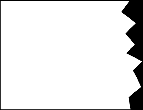
Estoy tratando de hacer un efecto de papel rasgado como la imagen de abajo:
Con el efecto rasgado en la parte inferior. Vi esto. y fue capaz de hacer un efecto de papel rasgado como se muestra a continuación
.box {
  width: 300px;
  height: 150px;
  background: darkred;
  position: relative;
  display: inline-block;
}
.box:after {
  position: absolute;
  content: "";
  width: 15px;
  height: 15px;
  transform: rotate(45deg);
  transform-origin: 0% 100%;
  background: darkred;
  left: 0;
  bottom: 0;
  box-shadow: 15px -15px 0 0 darkred, 30px -30px 0 0 darkred, 45px -45px 0 0 darkred, 60px -60px 0 0 darkred, 75px -75px 0 0 darkred, 90px -90px 0 0 darkred, 105px -105px 0 0 darkred, 120px -120px 0 0 darkred, 135px -135px 0 0 darkred, 150px -150px 0 0 darkred, 165px -165px 0 0 darkred, 180px -180px 0 0 darkred, 195px -195px 0 0 darkred;
}
<div class="box"></div>Pero el problema es que los bordes rasgados se parecen. Quiero que sean de diferentes tamaños con diferentes formas.
3 answers
Esto se puede hacer usando svg. Estoy usando Snap y jquery para hacerlo, ya que hace que todo sea mucho más fácil.
Los siguientes fragmentos crean efectos de papel rasgados aleatorios.
Nota: Soporte para snap-IE9 y superiores, Safari, Chrome, Firefox y Opera ver las especificaciones
Soporte para svg caniuse
$(document).ready(function() {
  var s = Snap('svg');
  var width = $('.content').outerWidth();
  $('.effect').width(width);
  var lastX = 0;
  var pointsArray = [0, 0];
  while (lastX <= width) {
    var randX = Math.floor(Math.random() * 25);
    var randY = Math.floor(Math.random() * 30);
    pointsArray.push(randX + lastX + ' ' + randY);
    lastX = lastX + randX;
  }
  var torn = s.polygon(pointsArray + " " + width + " 0").attr({
    fill: 'orange'
  })
})
.content {
width: 400px;
height: 400px;
background: orange;
padding: 20px;
}
.effect {
height: 50px;
}<script src="https://cdnjs.cloudflare.com/ajax/libs/snap.svg/0.3.0/snap.svg-min.js"></script>
<script src="https://ajax.googleapis.com/ajax/libs/jquery/1.9.0/jquery.min.js"></script>
<div class="torn">
<div class="content">Lorem ipsum dolor sit amet, consectetur adipiscing elit, sed do eiusmod tempor incididunt ut labore et dolore magna aliqua. Ut enim ad minim veniam, quis nostrud exercitation ullamco laboris nisi ut aliquip ex ea commodo consequat. Duis aute irure dolor
in reprehenderit in voluptate velit esse cillum dolore eu fugiat nulla pariatur. Excepteur sint occaecat cupidatat non proident, sunt in culpa qui officia deserunt mollit anim id est laborum.</div>
<div class="effect">
<svg width="100%" height="100%"></svg>
</div>
</div>Cómo funciona esto ?
Primero se crea un array para contener las coordenadas que son creados aleatoriamente por jquery. las coordenadas x e y se crean usando Math.random() y se añaden a la matriz.Antes de agregar a la matriz, la coordenada x actual se agrega a la última coordenada x recibida. Esto es para hacerlo continuo.
Cambiar la 10 en la variable randX nos permite aumentar o disminuir la longitud de una línea y cambiar la 30 en la variable randY nos permite cambiar la altura de una línea.
Aquí hay un fragmento que usa low randX
$(document).ready(function() {
var s = Snap('svg');
var width = $('.content').outerWidth();
$('.effect').width(width);
var lastX = 0;
var lastY = 0;
var pointsArray = [0, 0];
while (lastX <= width) {
var randX = Math.floor(Math.random() * 2);
var randY = Math.floor(Math.random() * 30);
pointsArray.push(randX + lastX + ' ' + randY);
lastX = lastX + randX;
}
var torn = s.polygon(pointsArray + " " + width + " 0").attr({
fill: 'orange'
})
}).content {
width: 400px;
height: 400px;
background: orange;
padding: 20px;
}
.effect {
height: 50px;
}<script src="https://cdnjs.cloudflare.com/ajax/libs/snap.svg/0.3.0/snap.svg-min.js"></script>
<script src="https://ajax.googleapis.com/ajax/libs/jquery/1.9.0/jquery.min.js"></script>
<div class="torn">
<div class="content">Lorem ipsum dolor sit amet, consectetur adipiscing elit, sed do eiusmod tempor incididunt ut labore et dolore magna aliqua. Ut enim ad minim veniam, quis nostrud exercitation ullamco laboris nisi ut aliquip ex ea commodo consequat. Duis aute irure dolor
in reprehenderit in voluptate velit esse cillum dolore eu fugiat nulla pariatur. Excepteur sint occaecat cupidatat non proident, sunt in culpa qui officia deserunt mollit anim id est laborum.</div>
<div class="effect">
<svg width="100%" height="100%"></svg>
</div>
</div>¿Le gustaría tener uno con frontera?
Cambiar polygon por polyline y añadir stroke
$(document).ready(function() {
var s = Snap('svg');
var width = $('.content').outerWidth();
$('.effect').width(width);
var lastX = 0;
var lastY = 0;
var pointsArray = [0, 0];
while (lastX <= width) {
var randX = Math.floor(Math.random() * 20);
var randY = Math.floor(Math.random() * 30);
pointsArray.push(randX + lastX + ' ' + randY);
lastX = lastX + randX;
}
var torn = s.polyline(pointsArray + " " + (width - 3) + " 0").attr({
fill: 'orange',
'stroke': 'black',
'stroke-width': 3
})
}).torn {
margin: 50px;
}
.content {
width: 400px;
height: 400px;
background: orange;
padding: 20px;
border: 3px solid #000;
border-bottom: 0;
}
.effect {
height: 50px;
}<script src="https://cdnjs.cloudflare.com/ajax/libs/snap.svg/0.3.0/snap.svg-min.js"></script>
<script src="https://ajax.googleapis.com/ajax/libs/jquery/1.9.0/jquery.min.js"></script>
<div class="torn">
<div class="content">Lorem ipsum dolor sit amet, consectetur adipiscing elit, sed do eiusmod tempor incididunt ut labore et dolore magna aliqua. Ut enim ad minim veniam, quis nostrud exercitation ullamco laboris nisi ut aliquip ex ea commodo consequat. Duis aute irure dolor
in reprehenderit in voluptate velit esse cillum dolore eu fugiat nulla pariatur. Excepteur sint occaecat cupidatat non proident, sunt in culpa qui officia deserunt mollit anim id est laborum.</div>
<div class="effect">
<svg width="100%" height="100%"></svg>
</div>
</div>¿No te gustan los efectos rasgados aleatorios ?
Sugeriría elegir un buen efecto rasgado de los aleatorios y copiar su html como lo he hecho aquí
.torn {
margin: 50px;
}
.content {
  width: 400px;
  height: 400px;
  background: orange;
  padding: 20px;
}
.effect {
  height: 50px;
}<div class="torn">
<div class="content">Lorem ipsum dolor sit amet, consectetur adipiscing elit, sed do eiusmod tempor incididunt ut labore et dolore magna aliqua. Ut enim ad minim veniam, quis nostrud exercitation ullamco laboris nisi ut aliquip ex ea commodo consequat. Duis aute irure dolor
in reprehenderit in voluptate velit esse cillum dolore eu fugiat nulla pariatur. Excepteur sint occaecat cupidatat non proident, sunt in culpa qui officia deserunt mollit anim id est laborum.</div>
<div class="effect" style="width: 440px;">
<svg width="100%" height="100%">
<desc>Created with Snap</desc>
<defs></defs>
<polygon points="0,0,10 25,20 15,27 21,43 24,51 14,70 9,84 25,88 18,96 11,100 20,113 6,117 5,123 1,136 25,151 29,157 4,166 29,181 2,197 28,212 8,226 8,232 12,240 8,254 16,270 5,279 26,291 5,304 0,307 5,325 26,329 18,347 3,360 5,372 26,382 9,393 21,406 27,411 8,415 4,429 8,441 19 437 0"
fill="#ffa500"></polygon>
</svg>
</div>
</div>¿Necesita imágenes de fondo ?
Agregue una imagen usando snap, establezca sus coordenadas y a -440 (es decir,altura del contenido.400 si se evita el relleno) y recortarlo usando el polígono
$(document).ready(function() {
  var s = Snap('svg');
  var width = $('.content').outerWidth();
  $('.effect').width(width);
  var lastX = 0;
  var lastY = 0;
  var pointsArray = [0, 0];
  while (lastX <= width) {
    var randX = Math.floor(Math.random() * 20);
    var randY = Math.floor(Math.random() * 30);
    pointsArray.push(randX + lastX + ' ' + randY);
    lastX = lastX + randX;
  }
  var img = s.image('https://placeimg.com/440/500/any', 0, -440, 440, 500)
  var torn = s.polygon(pointsArray + " " + (width - 3) + " 0").attr({

  })
  img.attr({
    'clip-path': torn
  })
})
.torn {
margin: 50px;
}
.content {
width: 400px;
height: 400px;
background: orange;
padding: 20px;
background: url('https://placeimg.com/440/500/any');
}
.effect {
height: 50px;
}<script src="https://cdnjs.cloudflare.com/ajax/libs/snap.svg/0.3.0/snap.svg-min.js"></script>
<script src="https://ajax.googleapis.com/ajax/libs/jquery/1.9.0/jquery.min.js"></script>
<div class="torn">
<div class="content">Lorem ipsum dolor sit amet, consectetur adipiscing elit, sed do eiusmod tempor incididunt ut labore et dolore magna aliqua. Ut enim ad minim veniam, quis nostrud exercitation ullamco laboris nisi ut aliquip ex ea commodo consequat. Duis aute irure dolor
in reprehenderit in voluptate velit esse cillum dolore eu fugiat nulla pariatur. Excepteur sint occaecat cupidatat non proident, sunt in culpa qui officia deserunt mollit anim id est laborum.</div>
<div class="effect">
<svg width="100%" height="100%"></svg>
</div>
</div>Warning: date(): Invalid date.timezone value 'Europe/Kyiv', we selected the timezone 'UTC' for now. in /var/www/agent_stack/data/www/ajaxhispano.com/template/agent.layouts/content.php on line 61
2016-06-12 15:18:08
Usando Rutas de clip:
El efecto de papel rasgado también se puede producir usando clip-path Se puede hacer solo con HTML y CSS, pero la versión CSS pura no produciría un efecto de clip aleatorio como podemos lograr usando SNAP u otras bibliotecas SVG, pero sí produce un efecto de papel rasgado.
El inconveniente de usar CSS clip-path es que actualmente solo se admite en navegadores Webkit. Firefox solo admite la sintaxis url() y, por lo tanto, necesita estar en línea SVGs mientras que no tiene absolutamente ningún soporte en IE. [ ¿Puedo Usar]
.torn-paper{
  height: 300px;
  width: 400px;
  background: tomato;
  -webkit-clip-path: polygon(0% 0%, 0% 97%, 2% 95%, 6% 99%, 12% 88%, 18% 92%, 27% 90%, 31% 97%, 39% 91%, 47% 95%, 60% 83%, 62% 81%, 69% 93%, 72% 96%, 79% 87%, 100% 99%, 100% 0%);
  clip-path: polygon(0% 0%, 0% 97%, 2% 95%, 6% 99%, 12% 88%, 18% 92%, 27% 90%, 31% 97%, 39% 91%, 47% 95%, 60% 83%, 62% 81%, 69% 93%, 72% 96%, 79% 87%, 100% 99%, 100% 0%);
}
<div class='torn-paper'>Lorem ipsum dolor sit amet</div>Como el clip-path está basado en porcentajes, por defecto es responsivo y puede funcionar cuando el contenedor div también tiene una imagen de fondo.
.torn-paper{
  height: 300px;
  width: 400px;
  background: url(http://lorempixel.com/400/300);
  -webkit-clip-path: polygon(0% 0%, 0% 97%, 2% 95%, 6% 99%, 12% 88%, 18% 92%, 27% 90%, 31% 97%, 39% 91%, 47% 95%, 60% 83%, 62% 81%, 69% 93%, 72% 96%, 79% 87%, 100% 99%, 100% 0%);
  clip-path: polygon(0% 0%, 0% 97%, 2% 95%, 6% 99%, 12% 88%, 18% 92%, 27% 90%, 31% 97%, 39% 91%, 47% 95%, 60% 83%, 62% 81%, 69% 93%, 72% 96%, 79% 87%, 100% 99%, 100% 0%);
}
<div class='torn-paper'>Lorem ipsum dolor sit amet</div>Si realmente queremos un efecto de papel rasgado al azar, podemos establecer las coordenadas de la ruta del clip polygon usando JS y luego agregarlo como un estilo en línea como en el siguiente fragmento. El fragmento utiliza un lógica similar a la de su respuesta para rellenar la matriz.
var el = document.getElementsByClassName('torn-paper')[0];

var lastX = 0,
  randX, randY, polygonPoints = ["0% 0%"];

randY = Math.floor(Math.random() * 20) + 80;

polygonPoints.push(lastX + '% ' + randY + '%');

while (lastX <= 100) {
  randX = Math.floor(Math.random() * 5);
  randY = Math.floor(Math.random() * 10) + 85;
  polygonPoints.push(randX + lastX + '% ' + randY + '%');
  lastX = lastX + randX;
}
polygonPoints.push("100% 0%");

el.style['-webkit-clip-path'] = 'polygon(' + polygonPoints.join() + ')';
el.style['clip-path'] = 'polygon(' + polygonPoints.join() + ')';
.torn-paper {
height: 300px;
width: 400px;
background: tomato;
}0
<div class='torn-paper'>Lorem ipsum dolor sit amet</div>No había hecho lo siguiente como mi respuesta principal porque los SVGs ya estaban cubiertos de una manera diferente en la respuesta de Akshay, pero usando SVG en línea para el clip-path también funcionaría en Firefox . IE todavía no lo apoyará.
var el = document.getElementsByClassName('torn-paper')[0];
var path = document.getElementById('clipper-path');

var lastX = 0,
  randX, randY, polygonPoints = ["0 0"];

randY = (Math.floor(Math.random() * 20) + 80) / 100;

polygonPoints.push(lastX + ' ' + randY + '');

while (lastX <= 1) {
  randX = Math.floor(Math.random() * 5) / 100;
  randY = (Math.floor(Math.random() * 10) + 85) / 100;
  polygonPoints.push(randX + lastX + ' ' + randY + '');
  lastX = lastX + randX;
}
polygonPoints.push("1 0");

path.setAttribute('d', 'M' + polygonPoints.join() + 'z');
.torn-paper {
height: 300px;
width: 400px;
background: tomato;
-webkit-clip-path: url(#clipper);
clip-path: url(#clipper);
}<svg width="0" height="0">
<defs>
<clipPath id="clipper" clipPathUnits="objectBoundingBox">
<path d='M0 0, 1 0, 1 1, 0 1z' id='clipper-path' />
</clipPath>
</defs>
</svg>
<div class="torn-paper">Lorem ipsum dolor sit amet</div>Usando Canvas:
Sé que no has etiquetado Lienzo, pero si eres buscar soporte en IE también entonces usar Canvas también sería una buena opción. Canvas tiene muy buen soporte para navegadores (igual que SVG). Lo incluyo aquí como otra opción que podría utilizarse.
El enfoque es muy similar al explicado anteriormente porque aquí también estamos creando un camino y luego recortando el lienzo basado en el camino.
Los siguientes fragmentos son probados en IE9+, Edge, Firefox, Chrome, Safari y Opera .
var canvas = document.getElementById('torn-canvas');
var ctx = canvas.getContext('2d');
var lastX = 0,
  randX, randY;

ctx.save();
ctx.beginPath();
ctx.moveTo(0, 0);

randY = (Math.floor(Math.random() * 10) + 85) / 100 * canvas.height;
ctx.lineTo(0, randY);

while (lastX <= canvas.width) {
  randX = (Math.floor(Math.random() * 7.5)) / 100 * canvas.width;
  randY = (Math.floor(Math.random() * 10) + 85) / 100 * canvas.height;
  lastX = lastX + randX;
  ctx.lineTo(lastX, randY);
}
ctx.lineTo(canvas.width, 0);
ctx.closePath();
ctx.clip();
ctx.beginPath();
ctx.fillStyle = 'tomato';
ctx.rect(0, 0, canvas.width, canvas.height);
ctx.fill();
ctx.restore();
.container {
position: relative;
height: 300px;
width: 400px;
}
#torn-canvas {
position: absolute;
z-index: -1;
}<div class='container'>
<canvas id='torn-canvas' height='300px' width='300px'></canvas>Lorem ipsum dolor sit amet...</div>Incluso podemos agregar una imagen como fondo dibujando primero la imagen en el Lienzo y luego recortándola para darle forma.
var canvas = document.getElementById('torn-canvas');
var ctx = canvas.getContext('2d');
var lastX = 0,
  randX, randY, img = new Image();

ctx.save();
img.src = 'http://lorempixel.com/400/300/nature/4';
img.onload = function() {
  ctx.drawImage(img, 0, 0);
}
ctx.restore();
ctx.beginPath();
ctx.moveTo(0, 0);

randY = (Math.floor(Math.random() * 10) + 85) / 100 * canvas.height;
ctx.lineTo(0, randY);

while (lastX <= canvas.width) {
  randX = (Math.floor(Math.random() * 5)) / 100 * canvas.width;
  randY = (Math.floor(Math.random() * 10) + 85) / 100 * canvas.height;
  lastX = lastX + randX;
  ctx.lineTo(lastX, randY);
}
ctx.lineTo(canvas.width, 0);
ctx.closePath();
ctx.clip();
ctx.beginPath();
ctx.rect(0, 0, canvas.width, canvas.height);
ctx.restore();
.container {
position: relative;
height: 300px;
width: 400px;
color: white;
}
#torn-canvas {
position: absolute;
z-index: -1;
}<div class='container'>
<canvas id='torn-canvas' height='300px' width='300px'></canvas>Lorem ipsum dolor sit amet...</div>Warning: date(): Invalid date.timezone value 'Europe/Kyiv', we selected the timezone 'UTC' for now. in /var/www/agent_stack/data/www/ajaxhispano.com/template/agent.layouts/content.php on line 61
2015-11-12 16:35:41
Estoy seguro de que este post está probablemente muerto, pero estoy dejando este comentario aquí en caso de que alguien lo encuentre útil. He creado un efecto irregular con el siguiente CSS:
clip-path: polygon(3% 0, 7% 1%, 11% 0%, 16% 2%, 20% 0, 23% 2%, 28% 2%, 32% 1%, 35% 1%, 39% 3%, 41% 1%, 45% 0%, 47% 2%, 50% 2%, 53% 0, 58% 2%, 60% 2%, 63% 1%, 65% 0%, 67% 2%, 69% 2%, 73% 1%, 76% 1%, 79% 0, 82% 1%, 85% 0, 87% 1%, 89% 0, 92% 1%, 96% 0, 98% 3%, 99% 3%, 99% 6%, 100% 11%, 98% 15%, 100% 21%, 99% 28%, 100% 32%, 99% 35%, 99% 40%, 100% 43%, 99% 48%, 100% 53%, 100% 57%, 99% 60%, 100% 64%, 100% 68%, 99% 72%, 100% 75%, 100% 79%, 99% 83%, 100% 86%, 100% 90%, 99% 94%, 99% 98%, 95% 99%, 92% 99%, 89% 100%, 86% 99%, 83% 100%, 77% 99%, 72% 100%, 66% 98%, 62% 100%, 59% 99%, 54% 99%, 49% 100%, 46% 98%, 43% 100%, 40% 98%, 38% 100%, 35% 99%, 31% 100%, 28% 99%, 25% 99%, 22% 100%, 19% 99%, 16% 100%, 13% 99%, 10% 99%, 7% 100%, 4% 99%, 2% 97%, 1% 97%, 0% 94%, 1% 89%, 0% 84%, 1% 81%, 0 76%, 0 71%, 1% 66%, 0% 64%, 0% 61%, 0% 59%, 1% 54%, 0% 49%, 1% 45%, 0% 40%, 1% 37%, 0% 34%, 1% 29%, 0% 23%, 2% 20%, 1% 17%, 1% 13%, 0 10%, 1% 6%, 1% 3%);
Ahora, estoy seguro de que esto se puede refinar aún más para dar un aspecto más convincente, pero creo que esta es una gran manera de dar una forma aproximada a un área de imagen.
Warning: date(): Invalid date.timezone value 'Europe/Kyiv', we selected the timezone 'UTC' for now. in /var/www/agent_stack/data/www/ajaxhispano.com/template/agent.layouts/content.php on line 61
2017-11-08 15:55:28