¿Cómo evitar que la animación de fotogramas clave css se ejecute al cargar la página?
Tengo un div en el que animo el contenido:
#container {
  position: relative;
  width: 100px;
  height: 100px;
  border-style: inset;
}
#content {
  visibility: hidden;
  -webkit-animation: animDown 1s ease;
  position: absolute;
  top: 100px;
  width: 100%;
  height: 100%;
  background-color: lightgreen;
}
#container:hover #content {
  -webkit-animation: animUp 1s ease;
  animation-fill-mode: forwards;
  -webkit-animation-fill-mode: forwards;
}
@-webkit-keyframes animUp {
  0% {
    -webkit-transform: translateY(0);
    visibility: hidden;
    opacity: 0;
  }
  100% {
    -webkit-transform: translateY(-100%);
    visibility: visible;
    opacity: 1;
  }
}
@-webkit-keyframes animDown {
  0% {
    -webkit-transform: translateY(-100%);
    visibility: visible;
    opacity: 1;
  }
  100% {
    -webkit-transform: translateY(0);
    visibility: hidden;
    opacity: 0;
  }
}
<div id="container">
<div id="content"></div>
</div>Al pasar el cursor, el contenido se desliza en el div del contenedor.
Mi problema es que cuando refresco la página, y la página se carga, se ejecutará la animación animDown de #content, y preferiría que se ejecutara solo después de un evento hover.
¿Hay alguna manera de hacer esto CSS puro, o tengo que averiguar algo en JS?
4 answers
Solución 1-Añadir animación en el primer hover
Probablemente la mejor opción es no poner la animación hacia abajo hasta que el usuario haya flotado sobre el container por primera vez.
Esto implica escuchar el evento mouseover y luego agregar una clase con la animación en ese punto, y eliminar el oyente de eventos. La principal (potencial) desventaja de esto es que se basa en Javascript.
;(function(){
    var c = document.getElementById('container');
    function addAnim() {
        c.classList.add('animated')
        // remove the listener, no longer needed
        c.removeEventListener('mouseover', addAnim);
    };

    // listen to mouseover for the container
    c.addEventListener('mouseover', addAnim);
})();
#container {
position:relative;
width:100px;
height:100px;
border-style:inset;
}
#content {
position:absolute;
top:100px;
width:100%;
height:100%;
background-color:lightgreen;
opacity:0;
}
/* This gets added on first mouseover */
#container.animated #content {
-webkit-animation:animDown 1s ease;
}
#container:hover #content {
-webkit-animation:animUp 1s ease;
animation-fill-mode:forwards;
-webkit-animation-fill-mode:forwards;
}
@-webkit-keyframes animUp {
0% {
-webkit-transform:translateY(0);
opacity:0;
}
100% {
-webkit-transform:translateY(-100%);
opacity:1;
}
}
@-webkit-keyframes animDown {
0% {
-webkit-transform:translateY(-100%);
opacity:1;
}
100% {
-webkit-transform:translateY(0);
opacity:0;
}
}<div id="container">
<div id="content"></div>
</div>Solución 2-jugar animación oculta
Otra forma de evitar esto es ocultar inicialmente el elemento, asegurarse de que la animación se reproduce mientras está oculto, luego hacerlo visible. La desventaja de esto es que el tiempo podría ser ligeramente apagado y se hace visible demasiado pronto, y también el hover no está disponible de inmediato.
Esto requiere algo de Javascript que espera la duración de la animación y solo entonces hace visible #content. Esto significa que también necesita establecer la inicial opacity a 0 para no aparece en la carga y también elimina el visibility de los fotogramas clave - estos no están haciendo nada de todos modos:
// wait for the animation length, plus a bit, then make the element visible
window.setTimeout(function() {
    document.getElementById('content').style.visibility = 'visible';
}, 1100);
#container {
position:relative;
width:100px;
height:100px;
border-style:inset;
}
#content {
visibility:hidden;
-webkit-animation:animDown 1s ease;
position:absolute;
top:100px;
width:100%;
height:100%;
background-color:lightgreen;
opacity:0;
}
#container:hover #content {
-webkit-animation:animUp 1s ease;
animation-fill-mode:forwards;
-webkit-animation-fill-mode:forwards;
}
@-webkit-keyframes animUp {
0% {
-webkit-transform:translateY(0);
opacity:0;
}
100% {
-webkit-transform:translateY(-100%);
opacity:1;
}
}
@-webkit-keyframes animDown {
0% {
-webkit-transform:translateY(-100%);
opacity:1;
}
100% {
-webkit-transform:translateY(0);
opacity:0;
}
}<div id="container">
<div id="content"></div>
</div>Solución 3 - Use transiciones
En su escenario, puede hacer este CSS solo reemplazando las keyframes con un transition en su lugar, por lo que comienza con opacity:0 y solo el hover tiene un cambio en opacity y el transform:
#container {
    position:relative;
    width:100px;
    height:100px;
    border-style:inset;
}

#content {
    position:absolute;
    top:100px;
    width:100%;
    height:100%;
    background-color:lightgreen;

    /* initial state - hidden */
    opacity:0;
    /* set properties to animate - applies to hover and revert */
    transition:opacity 1s, transform 1s;
}

#container:hover #content {
    /* Just set properties to change - no need to change visibility */
    opacity:1;
    -webkit-transform:translateY(-100%);
    transform:translateY(-100%);
}
<div id="container">
<div id="content"></div>
</div>Warning: date(): Invalid date.timezone value 'Europe/Kyiv', we selected the timezone 'UTC' for now. in /var/www/agent_stack/data/www/ajaxhispano.com/template/agent.layouts/content.php on line 61
2015-01-14 09:52:33
Siempre establezco la clase preload en body con el valor de tiempo de animación 0 y funciona bastante bien. Tengo algunas transiciones de vuelta, así que tengo que eliminar la animación de carga para ellos también. Resolví esto estableciendo temporalmente el tiempo de animación a 0. Puedes cambiar las transiciones para que coincidan con las tuyas.
HTML
... <body class="preload">...
CSS está configurando la animación a 0s
body.preload *{
animation-duration: 0s !important;
-webkit-animation-duration: 0s !important;
transition:background-color 0s, opacity 0s, color 0s, width 0s, height 0s, padding 0s, margin 0s !important;}
JS eliminará la clase después de algún retraso para que las animaciones puedan ocurrir en tiempo normal:)
setTimeout(function(){
    document.body.className="";
},500);
Warning: date(): Invalid date.timezone value 'Europe/Kyiv', we selected the timezone 'UTC' for now. in /var/www/agent_stack/data/www/ajaxhispano.com/template/agent.layouts/content.php on line 61
2016-07-10 21:29:03
Animación de rotación que (aparece) no se ejecutará hasta que sea necesario.
El CSS a continuación permite flechas arriba y abajo para mostrar los elementos del menú.
La animación no parece ejecutarse al cargar la página, pero realmente lo hace.
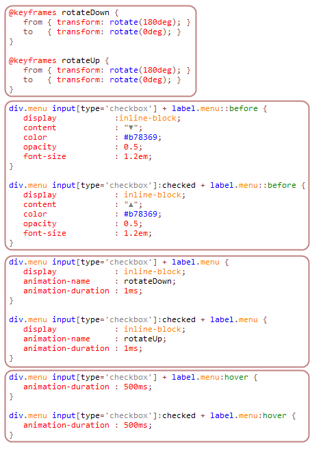
@keyframes rotateDown {
   from { transform: rotate(180deg); }
   to   { transform: rotate(0deg); }
}

@keyframes rotateUp {
   from { transform: rotate(180deg); }
   to   { transform: rotate(0deg); }
}

div.menu input[type='checkbox'] + label.menu::before {
   display            :inline-block;
   content            : "▼";
   color              : #b78369;
   opacity            : 0.5;
   font-size          : 1.2em;
}

div.menu input[type='checkbox']:checked + label.menu::before {
   display            : inline-block;
   content            : "▲";
   color              : #b78369;
   opacity            : 0.5;
   font-size          : 1.2em;
}

div.menu input[type='checkbox'] + label.menu {
   display            : inline-block;
   animation-name     : rotateDown;
   animation-duration : 1ms;
}

div.menu input[type='checkbox']:checked + label.menu {
   display            : inline-block;
   animation-name     : rotateUp;
   animation-duration : 1ms;
}

div.menu input[type='checkbox'] + label.menu:hover {
   animation-duration : 500ms;
}

div.menu input[type='checkbox']:checked + label.menu:hover {
   animation-duration : 500ms;
}
De arriba abajo:
- Crea las rotaciones. Para esto hay dos... una para la flecha hacia abajo y otra para la flecha hacia arriba. Se necesitan dos flechas, porque, después de la rotación, vuelven a su estado natural. Por lo tanto, la flecha hacia abajo se inicia y gira hacia abajo, mientras que la flecha hacia arriba comienza hacia abajo y gira hacia arriba.
- Crea las pequeñas flechas. Esta es una implementación directa de:: before
- ponemos la animación en la etiqueta. No hay nada especial, allí, excepto que la duración de la animación es 1ms.
- El ratón controla la velocidad de animación. Cuando el ratón pasa por encima del elemento, la animación-duración se establece en tiempo suficiente para parecer suave.
Warning: date(): Invalid date.timezone value 'Europe/Kyiv', we selected the timezone 'UTC' for now. in /var/www/agent_stack/data/www/ajaxhispano.com/template/agent.layouts/content.php on line 61
2018-04-25 23:11:20
¿Hay alguna manera de hacer esto CSS puro?
Sí, absolutamente : Ver el tenedor http://jsfiddle.net/5r32Lsme/2/ Realmente no hay necesidad de JS.
Y prefiero que se ejecute solo después de un evento de hover.
Así que necesitas decirle a CSS lo que sucede cuando NO es un evento de hover también-en tu ejemplo :
#container:not(:hover) #content {
  visibility: hidden;
  transition: visibility 0.01s 1s;
}
Pero hay dos cosas a tener en cuenta:
1) El retardo de transición anterior debe coincidir con su animación duración
2) No puede usar la propiedad que usa para ocultar la animación onLoad en la animación. Si necesita visibilidad en la animación, oculte la animación inicialmente como, por ejemplo,
#container:not(:hover) #content {
  top: -8000px;
  transition: top 0.01s 1s;
}
Una nota al margen:
Se recomienda poner las propiedades CSS nativas después de las prefijadas, por lo que debe ser
-webkit-animation-fill-mode: forwards;
animation-fill-mode: forwards;
Y ahora hay un nativo transform
-webkit-transform: translateY(0);
transform: translateY(0);
Warning: date(): Invalid date.timezone value 'Europe/Kyiv', we selected the timezone 'UTC' for now. in /var/www/agent_stack/data/www/ajaxhispano.com/template/agent.layouts/content.php on line 61
2018-06-04 11:06:37