Barra de progreso de porcentaje circular
Me gustaría tener un indicador de círculo porcentual en mi sitio:

En este caso muestra un 75%. ¿Cómo se debe hacer esto? Tengo el círculo amarillo en un archivo de imagen, pero si es más fácil, de alguna manera, hacerlo todo usando CSS, eso está bien para mí.
5 answers
Considerando la forma de la barra de progreso (extremo/inicio redondeado), sugeriría usar SVG.
DEMOSTRACIÓN: Barra de progreso radial
En el siguiente ejemplo, el progreso se anima con el atributo stroke-dasarray y los números % se incrementan con jQuery:
var count = $(('#count'));
$({ Counter: 0 }).animate({ Counter: count.text() }, {
  duration: 5000,
  easing: 'linear',
  step: function () {
    count.text(Math.ceil(this.Counter)+ "%");
  }
});
body{text-align:center;font-family: 'Open Sans', sans-serif;}
svg{width:30%;}<script src="https://ajax.googleapis.com/ajax/libs/jquery/2.1.1/jquery.min.js"></script>
<svg id="animated" viewbox="0 0 100 100">
<circle cx="50" cy="50" r="45" fill="#FDB900"/>
<path fill="none" stroke-linecap="round" stroke-width="5" stroke="#fff"
stroke-dasharray="251.2,0"
d="M50 10
a 40 40 0 0 1 0 80
a 40 40 0 0 1 0 -80">
<animate attributeName="stroke-dasharray" from="0,251.2" to="251.2,0" dur="5s"/>
</path>
<text id="count" x="50" y="50" text-anchor="middle" dy="7" font-size="20">100%</text>
</svg>Desafortunadamente IE no soporta animaciones svg SMIL. Para lograr el mismo resultado con el soporte de IE, puede utilizar un biblioteca como snap.svg y anima el atributo stroke-dasharray con JS:
var count = $(('#count'));
$({ Counter: 0 }).animate({ Counter: count.text() }, {
  duration: 5000,
  easing: 'linear',
  step: function () {
    count.text(Math.ceil(this.Counter)+ "%");
  }
});

var s = Snap('#animated');
var progress = s.select('#progress');

progress.attr({strokeDasharray: '0, 251.2'});
Snap.animate(0,251.2, function( value ) {
    progress.attr({ 'stroke-dasharray':value+',251.2'});
}, 5000);
body{text-align:center;font-family:sans-serif;}
svg{width:30%;}<script src="https://ajax.googleapis.com/ajax/libs/jquery/2.1.1/jquery.min.js"></script>
<script src="https://cdnjs.cloudflare.com/ajax/libs/snap.svg/0.3.0/snap.svg-min.js"></script>
<svg id="svg" viewbox="0 0 100 100">
<circle cx="50" cy="50" r="45" fill="#FDB900"/>
<path fill="none" stroke-linecap="round" stroke-width="5" stroke="#fff"
stroke-dasharray="1,250.2"
d="M50 10
a 40 40 0 0 1 0 80
a 40 40 0 0 1 0 -80"/>
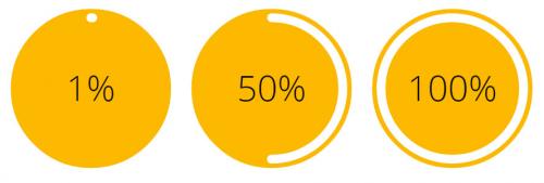
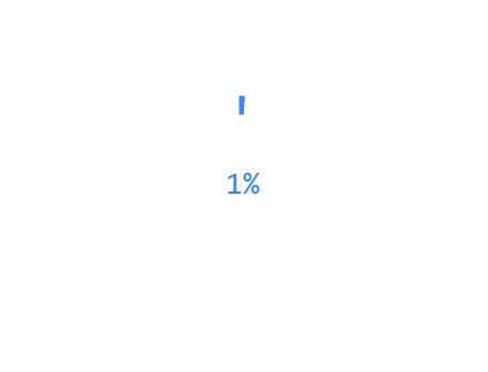
<text x="50" y="50" text-anchor="middle" dy="7" font-size="20">1%</text>
</svg>
<svg viewbox="0 0 100 100">
<circle cx="50" cy="50" r="45" fill="#FDB900"/>
<path fill="none" stroke-linecap="round" stroke-width="5" stroke="#fff"
stroke-dasharray="125.6,125.6"
d="M50 10
a 40 40 0 0 1 0 80
a 40 40 0 0 1 0 -80"/>
<text x="50" y="50" text-anchor="middle" dy="7" font-size="20">50%</text>
</svg>
<svg id="animated" viewbox="0 0 100 100">
<circle cx="50" cy="50" r="45" fill="#FDB900"/>
<path id="progress" stroke-linecap="round" stroke-width="5" stroke="#fff" fill="none"
d="M50 10
a 40 40 0 0 1 0 80
a 40 40 0 0 1 0 -80">
</path>
<text id="count" x="50" y="50" text-anchor="middle" dy="7" font-size="20">100%</text>
</svg>Warning: date(): Invalid date.timezone value 'Europe/Kyiv', we selected the timezone 'UTC' for now. in /var/www/agent_stack/data/www/ajaxhispano.com/template/agent.layouts/content.php on line 61
2015-04-16 07:05:34
Solución HTML / CSS pura
En resumen, usé las propiedades CSS border-radius y z-index para crear un medio círculo blanco en capas debajo de un círculo central naranja y un anillo exterior naranja. Inicialmente, el semicírculo está completamente oculto detrás de una capa adicional de naranja en el lado izquierdo, pero su borde exterior se revela gradualmente a medida que gira alrededor del eje central (a través de CSS transform: rotate()), creando la apariencia de una barra de progreso. Se requieren trucos adicionales una vez que pase la barra de progreso el punto medio (ver más abajo el fragmento para más información).
Todo esto se hizo con HTML puro y CSS, excepto la animación, que utiliza JavaScript. Puede parecer que requiere más código que las soluciones basadas en SVG, pero el marcado es en realidad mucho más simple, lo que lo convierte en una buena alternativa en mi opinión.
function setProgress(elem, percent) {
  var
    degrees = percent * 3.6,
    transform = /MSIE 9/.test(navigator.userAgent) ? 'msTransform' : 'transform';
  elem.querySelector('.counter').setAttribute('data-percent', Math.round(percent));
  elem.querySelector('.progressEnd').style[transform] = 'rotate(' + degrees + 'deg)';
  elem.querySelector('.progress').style[transform] = 'rotate(' + degrees + 'deg)';
  if(percent >= 50 && !/(^|\s)fiftyPlus(\s|$)/.test(elem.className))
    elem.className += ' fiftyPlus';
}

(function() {
  var
    elem = document.querySelector('.circlePercent'),
    percent = 0;
  (function animate() {
    setProgress(elem, (percent += .25));
    if(percent < 100)
      setTimeout(animate, 15);
  })();
})();
.circlePercent {
position: relative;
top: 26px;
left: 26px;
width: 96px;
height: 96px;
border-radius: 50%;
background: orange;
}
.circlePercent:before,
.circlePercent > .progressEnd {
position: absolute;
z-index: 3;
top: 2px;
left: 45px;
width: 6px;
height: 6px;
border-radius: 50%;
background: white;
-ms-transform-origin: 3px 46px;
transform-origin: 3px 46px;
content: "";
}
.circlePercent:after,
.circlePercent > .progress {
position: absolute;
-ms-transform-origin: 48px 48px;
transform-origin: 48px 48px;
z-index: 0;
top: 0;
left: 0;
width: 48px;
height: 96px;
border-radius: 48px 0 0 48px;
background: orange;
content: "";
}
.circlePercent.fiftyPlus:after {
background: white;
-ms-transform: rotate(180deg);
transform: rotate(180deg);
}
.circlePercent > .progress.progress {
background: white;
}
.circlePercent > .counter {
position: absolute;
box-sizing: border-box;
z-index: 2;
width: 100px;
height: 100px;
margin-top: -2px;
margin-left: -2px;
border-radius: 50%;
border: 4px solid orange;
}
.circlePercent > .counter:before {
position: absolute;
z-index: 1;
top: 50%;
margin-top: -13px;
width: 100%;
height: 26px;
font-size: 26px;
line-height: 26px;
font-family: sans-serif;
text-align: center;
color: white;
content: attr(data-percent) "%";
}
.circlePercent > .counter:after {
position: absolute;
width: 80px;
height: 80px;
top: 6px;
left: 6px;
border-radius: 50%;
background: orange;
content: "";
}
.circlePercent > .counter[data-percent="100"] {
background: white;
}<div class="circlePercent">
<div class="counter" data-percent="0"></div>
<div class="progress"></div>
<div class="progressEnd"></div>
</div>Observe que la clase fiftyPlus se agrega al elemento contenedor una vez que la barra de progreso alcanza el punto medio. Esto añade una estática barra de progreso a la mitad derecha del círculo. Sin él, el progreso parecerá drenar fuera del lado derecho en vez de llenar en el lado izquierdo.
Warning: date(): Invalid date.timezone value 'Europe/Kyiv', we selected the timezone 'UTC' for now. in /var/www/agent_stack/data/www/ajaxhispano.com/template/agent.layouts/content.php on line 61
2015-05-14 15:52:59
Demo : CODEPEN
Aquí está mi intento de obtener el indicador de círculo porcentual:
Path dibuja dos arcos y establezco el trazo-dasharray. realmente no necesitamos establecer el dasharray ya que lo establecemos más tarde con javascript.
Html
<svg class="circles" viewbox="0 0 200 200">
  <g id="first">
    <circle r="50" cx="100" cy="100" fill="#fb0"/>
    <path fill="none"
          stroke-linecap="round"
          stroke-width="7"
          stroke="#ffa"
          stroke-dasharray="250,250"
          d="M100 60
             A1 1 0 0 1 100 140
             A1 1 0 0 1 100 60"/>
    <text class="circ-text"
          text-anchor="middle"
          x="100" y="100"
          font-size="12px"
          fill="#ffa"
          >percentage
    </text>
  </g>
</svg>
Javascirpt
- Obtenga la ruta con
#first path. - Obtenga la longitud del dash-array:
path.getTotalLength(); - Aumentar el dash-array hasta su completo:
setAttribute('stroke-dasharray', i+","+length);Donde i se incrementa. - Averigüe en qué porcentaje estamos:
(count++/ticks)*100 - añadir el porcentaje al texto svg:
text.innerHTML=(count/tick)*100
var path = document.querySelector('#first path');
var text = document.querySelector('#first .circ-text');
var length = path.getTotalLength();
var i = 0;
var count = 0;
var ticks = 50;
setInterval(function() {
  if (i < length+length/ticks) {
    path.setAttribute('stroke-dasharray', i+","+length);
    i+=length/ticks;
    text.innerHTML=Math.round((count++/ticks)*100);
  }

}, 100);
var path = document.querySelector('#first path');
var text = document.querySelector('#first .circ-text');
var length = path.getTotalLength();
var i = 0;
var count = 0;
var ticks = 50;
setInterval(function() {
  if (i < length+length/ticks) {
  	path.setAttribute('stroke-dasharray', i+","+length);
    i+=length/ticks;
    text.innerHTML=Math.round((count++/ticks)*100);
  }

}, 100);
<svg class="circles" viewbox="0 0 500 200">
<g id="first">
<circle r="50" cx="100" cy="100" fill="#fb0" />
<path fill="none" stroke-linecap="round" stroke-width="7" stroke="#ffa" stroke-dasharray="250,250" d="M100 60 A1 1 0 0 1 100 140
A1 1 0 0 1 100 60" />
<text class="circ-text" text-anchor="middle" x="100" y="100" font-size="12px" fill="#ffa">percentage</text>
</g>Warning: date(): Invalid date.timezone value 'Europe/Kyiv', we selected the timezone 'UTC' for now. in /var/www/agent_stack/data/www/ajaxhispano.com/template/agent.layouts/content.php on line 61
2015-04-14 08:35:56
Circular PercentBarra de progreso usando Canvas...
var ctx = document.getElementById('circularLoader').getContext('2d');
var al = 0;
var start = 4.72;
var cw = ctx.canvas.width;
var ch = ctx.canvas.height;
var diff;
function progressSim(){
	diff = ((al / 100) * Math.PI*2*10).toFixed(2);
	ctx.clearRect(0, 0, cw, ch);
	ctx.lineWidth = 17;
	ctx.fillStyle = '#4285f4';
	ctx.strokeStyle = "#4285f4";
	ctx.textAlign = "center";
	ctx.font="28px monospace";
	ctx.fillText(al+'%', cw*.52, ch*.5+5, cw+12);
	ctx.beginPath();
	ctx.arc(100, 100, 75, start, diff/10+start, false);
	ctx.stroke();
	if(al >= 100){
		clearTimeout(sim);
	    // Add scripting here that will run when progress completes
	}
	al++;
}
var sim = setInterval(progressSim, 50);
<div id="loader">
<canvas id="circularLoader" width="200" height="200"></canvas>
</div>Ver Demo: - http://codingflag.in/mysketch.php?sketch=9
Warning: date(): Invalid date.timezone value 'Europe/Kyiv', we selected the timezone 'UTC' for now. in /var/www/agent_stack/data/www/ajaxhispano.com/template/agent.layouts/content.php on line 61
2016-07-25 08:29:46
¿has probado esto?
<percent-display percent="75" side="" colors=""></percent-display>
Fuente: http://angularscript.com/angularjs-round-percentage-bar-directive-ngpercentdisplay/
Warning: date(): Invalid date.timezone value 'Europe/Kyiv', we selected the timezone 'UTC' for now. in /var/www/agent_stack/data/www/ajaxhispano.com/template/agent.layouts/content.php on line 61
2015-04-08 07:49:16